 FoxChild@Learn
15. Geographical skills and fieldwork
Curriculum status: Required core content.
This guide follows the England Key Stage 3 Geography programme of study. Schools choose their own sequence and detailed place exemplars; this guide brings together the map, visual, data and enquiry skills that can be used across the whole course. It is a practical reference: worked coordinates and fieldwork datasets are invented for teaching, clearly labelled as illustrative, and should not be mistaken for a real survey or location.
Required knowledge
- Use maps, atlases, globes, OS maps, aerial and satellite imagery, and GIS to locate, measure, compare and interpret places.
- Plan geographical enquiries around focused questions; collect primary evidence safely, consistently and ethically, and use secondary evidence critically.
- Select and construct suitable maps, graphs, sketches and written explanations; analyse patterns, relationships, anomalies and change.
- Draw evidence-based conclusions, evaluate methods and recognise the limits of sampling, measurement, scale, classification and data sources.
Key vocabulary
| Term | Meaning |
|---|---|
| atlas | collection of maps organised for reference or study |
| aerial photograph | image of the ground taken from above, commonly by an aircraft or drone |
| base map | map providing geographic reference beneath added information |
| bias | systematic influence that makes evidence or selection unrepresentative |
| choropleth map | map shading areas by a measured value or rate |
| contour | line joining points of equal height above a stated datum |
| cross-section | side-on profile showing change across a line, such as a valley or slope |
| data | recorded observations or measurements used as evidence |
| datum | reference level from which a height or measurement is calculated |
| field sketch | selective drawing of a view, labelled with observed evidence |
| Geographic Information System (GIS) | computer system for storing, analysing and displaying data linked to locations |
| georeference | link information to a known location or coordinate system |
| grid reference | coordinate locating a square or point within a map grid |
| hypothesis | testable proposed explanation or relationship |
| interval | fixed difference between values on a scale, axis or class |
| isoline | line joining places with the same measured value, such as height or temperature |
| key / legend | explanation of a map's symbols, colours or line styles |
| land use | purpose for which an area of land is used |
| mean | total of values divided by their number |
| median | middle value after values are arranged in order |
| mode | most frequent value or category |
| outlier | value much further from the pattern of other observations |
| primary data | first-hand evidence collected for a particular enquiry |
| qualitative data | descriptive or categorical information, not necessarily numerical |
| quantitative data | information represented as numbers or measurements |
| range | difference between the largest and smallest values in a set |
| reliability | degree to which a method gives consistent results when repeated suitably |
| representativeness | extent to which a sample reflects the population or places being studied |
| risk assessment | process for identifying significant hazards and deciding proportionate controls |
| sampling | selecting observations from a wider population or area |
| scale | relationship between a map distance and the corresponding ground distance |
| secondary data | evidence already collected or published by another person or organisation |
| site | characteristics of the actual ground where a place is located |
| situation | a place's position relative to other places, routes or regions |
| spatial data | information that includes a location or geographic reference |
| systematic sample | observations taken at regular intervals or according to a repeated rule |
| transect | planned line along which observations are recorded |
| validity | how well evidence and method answer the enquiry question |
| variable | factor that can take different values or categories |
| weather | atmospheric conditions at a place and time |
| working hypothesis | a provisional testable statement that guides data collection |
How the geography works
Geography asks where something is, what pattern it forms, how it changes and why those patterns matter. A map, graph, interview or field measurement is not an answer by itself. It is a carefully selected representation of some part of the world. To use evidence well, identify the question, place, scale, date, source, measurement and limitations. Then describe the pattern accurately, explain it with relevant geographical processes, compare it with other evidence, and decide how strongly it supports a conclusion.
A map is a model of selected reality. A paper map uses symbols and generalisation so a reader can see chosen features at a useful scale. A satellite image records reflected or emitted energy in a particular band, at a particular time and resolution; a labelled land-cover map interprets some of those signals into classes. A field count records what one team observed at one site, during a stated interval. Each can be useful, but none is a complete view of a place.
Geographical enquiry combines different evidence. Secondary information may help identify patterns and plan a route; primary evidence can test a specific local question. A reliable conclusion is not the longest description or the most confident claim. It is a response that matches the evidence, considers other possible explanations and states how far the available method supports it.
Place example
A school could study a route from its entrance to a nearby high street, comparing how pedestrian movement, land use and access change along it. This is a model for planning an enquiry, not a fixed national case study: each school should select an accessible place, obtain the required approval and use a safe, supervised route. Before collecting data, pupils can use an OS map or school GIS to mark observation points, measure route distance and identify crossings, public paths and possible barriers. The team can then conduct brief counts and a consistent land-use survey at a set of points. A classroom comparison might add census or local-plan evidence, but those sources use different dates and boundaries from the field observations. The conclusion should describe the route and survey period, not claim that a short sample represents every street or resident in the wider settlement.
Maps, data and evidence
For every map, graph, image or field sheet, record the question, location, scale, date, source, definition, units and method. Compare like with like: match time periods and boundaries, use rates where population or area differs, and check that a symbol or colour means what the legend says. Combine evidence where it can test the same claim—for example, a pedestrian count with a land-use map and a route plan—while keeping observed measurements separate from explanations. State the sample and note uncertainty, missing data and anomalies. In a worked calculation, show each conversion: at 1:25,000, 4 cm × 25,000 = 100,000 cm = 1 km.
1. Choosing a suitable map or globe
Start with purpose and scale
A world map is useful for locating continents, oceans, major latitude lines and broad connections. It cannot show the detailed position of every building in a town. A local large-scale map can show streets, paths and individual symbols, but it covers a much smaller area. In cartography, large scale means a larger representative fraction such as 1:25,000: the ground is reduced less, so more detail is visible. A small-scale map such as a world map displays a large area with less local detail. This language can feel backwards; remember to compare the denominator, not the printed page size.
A globe represents the overall shape of Earth more faithfully than a flat world map, but it is awkward for seeing the whole surface at once and cannot provide large-scale local detail. Any flat world map uses a projection: a way to transfer locations from a sphere to a plane. Projections preserve some properties better than others. A familiar rectangular projection can make high-latitude areas appear much larger relative to equatorial areas. When comparing country areas or distances on a world map, ask what projection is used and whether the comparison is fair.
Choose a map for the question. To compare broad climate belts, use a world map with latitude, climate zones and a clear legend. To investigate access to a town centre, use a street map or suitable GIS layers. To explain a coastal landscape, use a map showing contour, coast, geology or land use as needed. A map without the relevant data cannot answer a question just because it looks detailed.
Read map furniture before interpreting
Map furniture includes the title, key, scale, orientation, projection or coordinate system, source and date. First check what area and topic the map covers. Then read units, categories and symbols. On a thematic map, ask whether classes are equal or unequal intervals and whether a value is a count, percentage, rate or average. A dark colour may mean a high value, but the legend—not assumption—defines it.
A map title such as “Population” is incomplete without a date, geographical unit and measure. “Population density, people per square kilometre, local authorities, 2021” communicates more. A choropleth map of total population may mainly shade large administrative areas, while a density map divides by area. Even density can conceal variation within a district: people may be concentrated in one town and sparse elsewhere. Pair the map with a second source or a closer-scale view if the question needs more detail.
Boundaries matter. Administrative boundaries help compare official statistics but may not match functional regions such as a commuter area or river catchment. A road line may show a route but not congestion, accessibility or travel time. A boundary can separate colour classes even where real change across it is gradual. State what the map demonstrates and what it does not.
2. Latitude, longitude and global location
Latitude measures angular position north or south of the Equator, from 0° at the Equator towards 90° at the poles. Lines of latitude run east–west and are parallel. Longitude measures angular position east or west from the Prime Meridian, from 0° towards 180°. Lines of longitude meet at the poles. A coordinate pair states latitude and longitude, and conventionally is written latitude first, then longitude. Include N or S and E or W, or use signed decimal degrees with the convention explained.
For example, an imaginary point at 20°N, 30°E lies north of the Equator and east of the Prime Meridian. The coordinate is more precise if minutes or decimals are added. Do not confuse a coordinate with a grid reference: latitude and longitude describe positions on a global coordinate system, while an OS National Grid reference identifies a square or point in Britain's projected grid.
Coordinates help locate a place, but they do not explain it. Two places at similar latitude can have different climates because of altitude, ocean currents, distance from the sea, prevailing winds and relief. A precise location does not tell the reader about local access, population or conditions without additional evidence. A geographical description usually combines absolute location with relative location: for example, “the settlement is at 54°N, close to the coast and connected to the regional city by a main road.”
On a globe or atlas, locate the Equator, Tropics of Cancer and Capricorn, Arctic and Antarctic Circles, Prime Meridian, continents and oceans before describing a pattern. Lines may be drawn at different intervals, so read the labels. If a map uses a graticule, estimate between lines carefully and state the precision justified by the spacing. Do not report seconds of arc from a map that only supports a rough estimate.
3. The Ordnance Survey National Grid
Eastings, northings and grid references
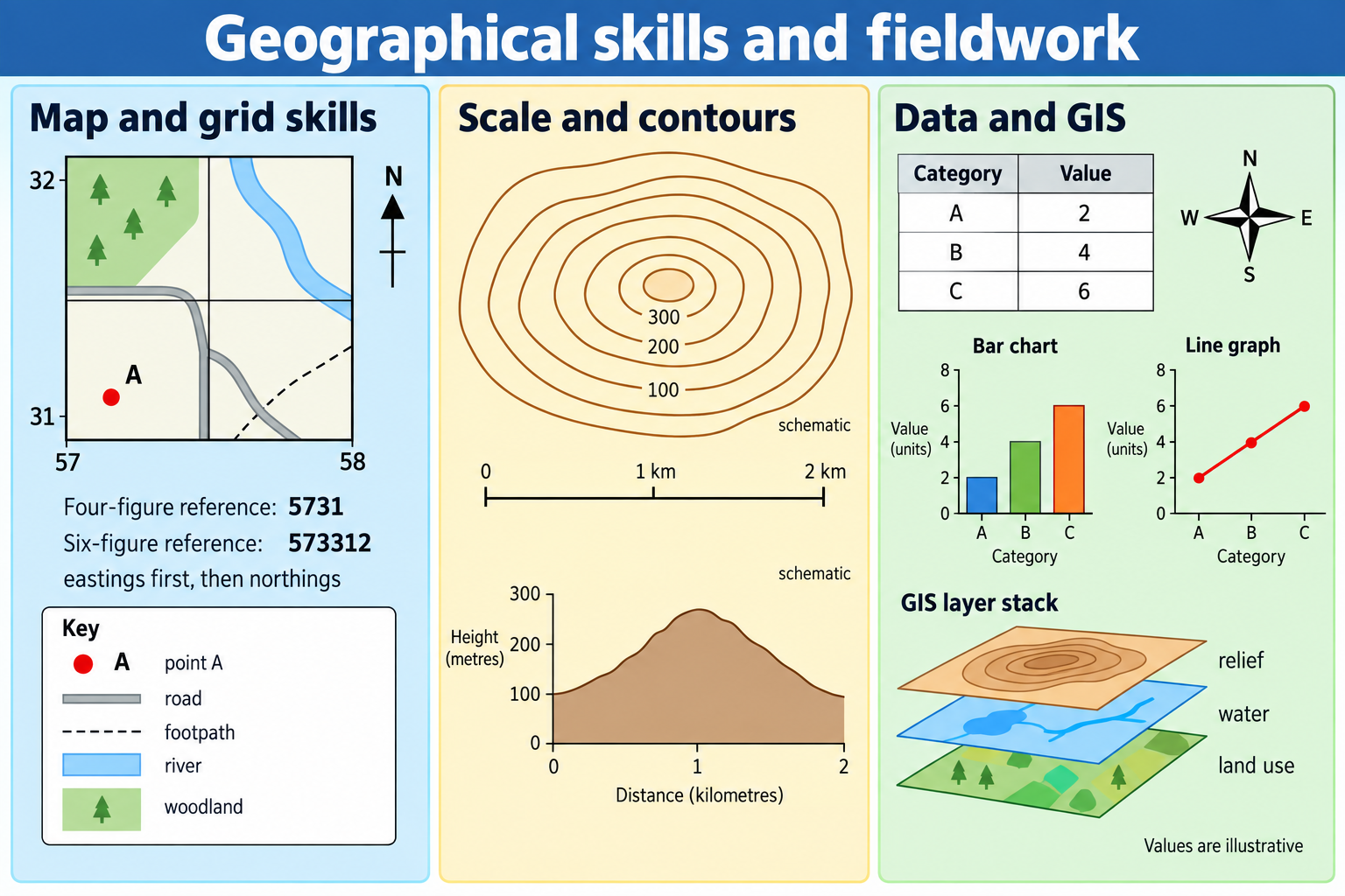
The OS National Grid divides Great Britain into a coordinate system. Grid lines run east–west and north–south; the labels allow a reader to locate places. The core memory rule is along the corridor, then up the stairs: read eastings first, then northings. A four-figure grid reference names a 1 km square on a standard kilometre grid; a six-figure reference estimates a position within that square, usually to roughly 100 m. The grid letters, where shown, identify the larger grid square and must be retained when required by the map or task.
To find a four-figure reference, locate the vertical easting line immediately to the left of the feature, then the horizontal northing line immediately below it. Read the easting number first and the northing second. If an illustrative map has the feature inside the square whose left vertical line is 42 and lower horizontal line is 61, its four-figure reference is 4261. This identifies the square, not an exact point. To estimate a six-figure reference, divide the square into tenths. If the point lies about three tenths across and seven tenths up, write 423617. These are invented teaching coordinates; they are not a real place.
For accuracy, do not reverse the numbers, start from the line on the right or above, or estimate more precision than the map permits. A common method is to place a transparent romer or ruler over the square: mark the fraction across for the easting, then the fraction up for the northing. If a map gives grid letters, put them before the figures. In examinations, follow the coordinate format requested and show the method if a calculation is involved.
A six-figure reference is more precise than a four-figure reference, but precision is not the same as accuracy. If a map is old, damaged, distorted or printed at the wrong size, the apparent position may be misleading. A coordinate also has a coordinate reference system; transferring it into a different projection or datum without conversion may create errors. For KS3 work, use the grid and conventions shown on the map provided.
Direction and bearing
Compass directions describe orientation. North, east, south and west are cardinal directions; north-east, south-east, south-west and north-west are intercardinal directions. A 16-point compass adds more intermediate directions. “The school is south-west of the station” gives a general direction. A bearing gives a more precise angle clockwise from grid north, written as three figures from 000° to 360°. For instance, 045° is north-east; 090° is east; 180° is south; 270° is west.
Before using a bearing, check whether the task wants a grid bearing or a magnetic bearing. A paper map's grid north may not exactly match magnetic north, and the difference changes over time and location. A classroom map exercise normally expects the grid direction printed on that map. Align a protractor's centre on the starting point, its baseline with north, and read clockwise to the line joining the two places. State the bearing in three figures, including any leading zero.
Direction words depend on the map's orientation. Many maps are printed north-up, but an oblique aerial photo or rotated map may not be. Look for a north arrow, graticule or grid. Never infer north from the top of an image unless orientation is confirmed.
4. Scale, distance, area and route measurement
Representative fraction and scale bar
A scale of 1:25,000 means one unit on the map represents 25,000 of the same units on the ground. If a straight line between two points is 4 cm on a map at 1:25,000, the ground distance is 4 × 25,000 = 100,000 cm. There are 100,000 centimetres in one kilometre, so the distance is 1 km. The units must be converted. At 1:50,000, 2 cm represents 100,000 cm, also 1 km.
A scale bar gives a visual distance key. It has an advantage over a representative fraction when a map is enlarged or reduced because the bar usually changes size with the map. To measure a straight route, align a ruler between the points and compare the length with the scale bar. To measure a winding path, use a piece of string or mark a paper strip along short segments, then compare the total length. This approximates distance along the line; it is not travel time.
A route can be longer than the straight-line distance. Suppose the straight distance between a school and a park is 1.2 km, but the public-path route bends around a railway and measures 1.7 km. The route is 0.5 km longer. It would be wrong to infer that the walking time is simply proportional if the path has steep slopes, crossings, steps or variable surfaces. Distance, accessibility and journey time are related but different measures.
Map enlargement, unit conversion and area
If the map has been resized after printing, the printed ratio may no longer be correct. Check a scale bar printed on the same map. If an OS sheet is photocopied with 150% enlargement in one direction but not the other, both distance and shape may be distorted; measurements in different directions may be unreliable. Digital screens can also zoom, so do not measure against a printed page scale unless the scale remains calibrated.
Area scales as the square of a linear scale factor. At 1:25,000, a 1 cm by 1 cm square on the map represents 250 m by 250 m on the ground, an area of 62,500 m² or 6.25 hectares. It does not represent 250 m². Convert carefully: 1 hectare is 10,000 m²; 1 km² is 100 hectares. Area measurements from irregular boundaries are estimates, especially when the line thickness or image resolution is large relative to the feature.
When calculating percentage change, use the starting value as the denominator: percentage change = (new value − starting value) ÷ starting value × 100. If a mapped woodland area rises from 20 ha to 25 ha, the increase is 5 ha, or 5 ÷ 20 × 100 = 25%. A change of 5 hectares is not a 5% change. Always give units and indicate the time period.
5. Relief, contours and cross-sections
Reading contour patterns
A contour line joins points of equal height above a stated datum, commonly mean sea level. The contour interval is the vertical difference between adjacent contour lines. Read the map's contour interval before estimating slope. Closely spaced contours indicate a steep slope because height changes over a short horizontal distance; widely spaced contours indicate a gentler slope. Contours that nearly touch may show very steep ground or a cliff, depending on the mapping convention. Closed contours often represent a hill if heights rise towards the centre; hachures or special symbols may indicate a depression.
Contour shapes can reveal landforms. A V-shaped contour pattern pointing upstream often crosses a river valley; the contour V points towards higher land and the stream flows in the opposite direction. A ridge may form a line of higher ground with slopes falling away on both sides. A spur projects from higher ground; valleys indent the slope. A plateau has an elevated area with a comparatively level top, although its edges can be steep. A map's contour lines describe height, not rock type or vegetation, so use additional layers or evidence before explaining why a landform exists.
A spot height gives a measured height at one point. A triangulation pillar or trig point marks a surveyed point from which bearings may be taken; its symbol does not mean that the surrounding ground is a perfect cone. Benchmarks indicate surveyed height information. Read the map key, which can vary by map series and edition.
Calculate gradient
Gradient compares vertical rise with horizontal distance. A simple expression is gradient = vertical interval ÷ horizontal distance. If a path rises 60 m over a horizontal distance of 1,500 m, its gradient is 60 ÷ 1,500 = 0.04, or 1 in 25. Express the units or ratio clearly. A steeper route can be tiring and may affect travel, erosion and land use, but the gradient calculation alone does not describe surface condition or accessibility.
When using contours, count the vertical difference between the start and end heights, not the number of contour lines times an arbitrary value. For example, if the start is 80 m and the finish is 140 m, the rise is 60 m. Measure the horizontal ground distance with the map scale. Avoid confusing a straight map distance with the longer route followed on the ground. If the question asks for the average gradient of a winding route, state that the straight horizontal distance is an approximation.
Draw and interpret a cross-section
A cross-section translates relief along a selected line into a side-on profile. Place a strip of paper between the endpoints; mark where it crosses each contour; note each height; transfer those distances to graph paper; plot height against distance; join points with a smooth line that follows the evidence. Label the horizontal scale and vertical scale. If the vertical scale is exaggerated, state the vertical exaggeration, calculated as vertical scale denominator compared with horizontal scale denominator when both are written as ratios.
A profile highlights valleys, ridges and slope changes along one transect; it does not show the full width of the land or features beyond that line. A second profile may show a different shape. Plot contour crossings carefully, keeping real changes while avoiding accidental jagged joins.
6. Map symbols, land use and generalisation
OS maps use symbols, colour and line style to represent features. The key is essential: roads may differ by class, water may use blue, woodland a green pattern, and public rights of way a particular dashed line. Exact conventions vary by map series and edition. Learn how to read the key rather than relying on memory. A symbol often represents an area or feature too small to draw to its exact dimensions at that scale; it is a location cue, not a photograph.
Maps use generalisation to make a complex world readable. A small-scale map may omit minor roads, simplify coastlines or combine land uses. A building can appear larger than its actual footprint so that it remains visible. These decisions improve usability but reduce detail. If the map does not show a path, that does not prove there is no path: the feature may be omitted because of scale, age, data policy or classification. Cross-check with a current source where access matters.
Land-use maps classify what an area is used for at a stated time. Categories might include residential, commercial, industrial, transport, recreation and open space. Boundaries can be mixed or ambiguous: a block may contain shops below flats, a park may include a café, and a farm may include woodland. State the classification rule and date. A field survey can capture current use, while an old map records a historical snapshot.
A field sketch is selective. It should show the main features relevant to the enquiry and have a title, location, direction/viewpoint and labels that refer to visible evidence. A sketch of a river valley investigating floodplain land use might annotate the channel, floodplain width, embankment, housing, vegetation, bridges and evidence of past inundation if visible. Avoid drawing every tree and building without purpose. A sketch records the observer's view and choices; it should not be presented as a complete or scaled survey unless it has been constructed to those standards.
7. Aerial photographs and satellite images
An aerial photograph may be vertical, with the camera directed downwards, or oblique, looking across the landscape. A vertical image can support measurement and map comparison if scale, lens distortion, terrain and georeferencing are understood. An oblique photo is often easier to interpret visually, but scale varies across the frame and objects nearer the camera can appear larger. A photograph shows what was visible at a time; it may not reveal land ownership, function, population, environmental quality or seasonal use.
Satellite imagery collects energy reflected or emitted by Earth's surface in one or more wavelength bands. A true-colour image approximates how the scene may look to a human eye, while false-colour combinations assign invisible wavelengths to colours to make patterns easier to distinguish. Vegetation, water, bare soil and built surfaces can have different spectral signatures, but those signatures can overlap. Clouds, shadows, atmosphere, sun angle, sensor resolution and date affect what is recorded.
A land-cover classification groups pixels into categories such as water, vegetation or urban surface. Land cover means the physical material on the surface; land use means the human purpose or function. A sports pitch and a meadow may both be grass cover but have different uses. A warehouse roof and a road may both be sealed surfaces but have different functions. Classification errors arise when the pixel covers several features, categories are too broad, the image is cloudy, or seasonal change alters the appearance.
To compare two images, check that they cover the same area, use compatible resolutions and bands, and were taken in comparable seasons if vegetation is involved. Identify the dates. A difference might be real land-use change, a seasonal effect, a different sensor or a classification threshold. Use a reference map, field observation or a second dataset to check the interpretation. Never call a colour patch “deforestation” or “urban growth” without evidence of change across dates and a defined area.
8. Geographic Information Systems (GIS)
GIS links data to locations and allows layers to be viewed and analysed together. A simple school GIS project might overlay a base map, roads, public transport stops, population data, land use, rivers and a proposed development site. Each layer answers a different question. A road layer does not automatically show traffic volume; a bus-stop point does not indicate how frequent or accessible the service is; a population polygon average does not locate each person. Read the attribute table and metadata.
Spatial data can be stored as vector points, lines and polygons or as raster grids of cells. A school entrance can be a point, a path a line, and a park a polygon. A satellite-derived elevation model may be a raster. The best form depends on the measurement and question. Vector data can provide precise boundaries but may imply sharp edges where reality changes gradually. Raster data represent continuous surfaces but depend on cell size and classification. Small cells provide more detail and larger files; coarse cells smooth small features.
Layer alignment depends on coordinate reference systems. If layers use different projections or datums, they may not line up until correctly transformed. A projected coordinate system helps measure distance and area but distorts some properties. A global geographic coordinate system uses angular latitude and longitude. In KS3, you may not need to perform a technical transformation, but you should recognise that map layers must use compatible location references.
GIS can perform operations such as buffer, overlay, measure, route, query and classify. A buffer shows an area within a stated distance of a feature, such as 500 m from a bus stop. Overlay can identify where several conditions coincide, such as flood exposure and land use. A route tool can estimate distance or travel time under a chosen network and assumptions. These are models, not neutral answers: choices about distance, categories, data year, transport speed, barriers and thresholds affect the result.
A good GIS map includes a descriptive title, legend, scale, north indicator when appropriate, source, date, units and a readable hierarchy. Avoid rainbow colour ramps for ordered data if they imply categories that do not exist. For rates, use a sequential light-to-dark scale; for values above and below a meaningful midpoint, a diverging scale may be suitable. For categories without order, use distinct colours. A classification method such as equal intervals, quantiles or natural breaks can change the apparent pattern. Explain the method and do not hide important outliers.
9. Asking a geographical question and forming a hypothesis
A strong enquiry question is geographical, focused, answerable with available methods, safe and narrow enough to investigate. “Is the town good?” is vague and value-laden. “How does building density change with distance from the town-centre high street?” identifies a variable, location and pattern. “Does pedestrian count differ between the market square and residential street during the same 15-minute period?” can be tested if appropriate locations, times and permissions are chosen.
A hypothesis predicts a pattern or relationship that evidence could support, challenge or refine. Example: “Pedestrian counts will be higher at the town-centre shopping street than at a residential street between 11:00 and 11:15 on a weekday.” The prediction needs a comparable day and time, count duration, site definition and method. If the hypothesis is too broad, the survey cannot test it. If it assumes a cause without measuring the proposed cause, the conclusion must be cautious.
Operationalise the question: decide exactly how each concept will be observed. “Busy” could mean number of people passing a fixed line during 10 minutes; “quality of place” might use a carefully defined environmental-quality scale; “steep” could mean an angle measured with a clinometer or a contour-derived gradient. Explain categories so two observers can apply the same rule. A rating such as “nice = 5” is not a robust measure unless its criteria are defined and the subjectivity is discussed.
Before fieldwork, conduct a desk study: inspect maps and imagery, gather relevant background statistics, identify site access and likely hazards, and refine the method. A pilot survey tests whether the form, timing and equipment work. A pilot can reveal that categories overlap, traffic is too fast to count safely, or a survey takes longer than expected. Changing a flawed method before the main collection is a strength, but document any changes so the data can be interpreted correctly.
10. Variables and fair comparisons
An independent variable is the factor intentionally changed or used to organise a comparison; a dependent variable is the measured outcome. In a transect away from a town centre, distance from the centre may be the independent variable and building height or land-use score may be the dependent variable. Other factors such as street width, time of day, roadworks, weather and special events may influence the result. In human geography, the researcher often observes naturally occurring differences rather than controlling them experimentally, so a relationship does not prove direct causation.
Control variables are conditions kept similar where possible. To compare pedestrian flow at two sites, count for the same duration, use matched time periods, apply the same definition and count the same direction or both directions consistently. If one site is measured during a festival and the other on a normal day, the site difference is confounded by the event. If equal conditions cannot be achieved, record the difference and discuss how it might affect the conclusion.
A fair comparison also requires comparable spatial units, definitions, dates and denominators. Comparing the number of bus stops in two districts is misleading if one district is twice as large. Use stops per square kilometre or per population when that measure answers the question. Comparing school-age population from different census years may reflect changing boundaries as well as population change. Harmonise area definitions where possible; otherwise state the mismatch.
Avoid claims that confuse correlation with causation. If a map shows lower income in areas farther from a centre, distance may be linked with housing cost, transport, land use, population age or other factors. A scatter graph can show association, but it cannot identify the mechanism without additional evidence. Write “the data show an association” and suggest plausible explanations to investigate, rather than claiming that one variable caused another from a single chart.
11. Choosing a sampling strategy
The population is the full group, area or set of observations relevant to the question. A sample is the subset actually studied. Sampling saves time, but poor selection can produce a misleading picture. Choose a strategy that matches the spatial pattern and practical constraints.
- Random sampling: locations or people are selected by a chance method. This can reduce deliberate selection bias, but random sites may cluster or miss rare features in a small sample. It requires a sampling frame and care with consent and privacy when people are involved.
- Systematic sampling: measurements are taken at regular intervals, such as every 50 m along a route. It is straightforward and spreads observations across a transect, but a regular interval can coincide with a repeating pattern, and starting point matters.
- Stratified sampling: divide the study area into meaningful groups—such as inner, middle and outer zones—then sample each group, often in proportion to its size. This ensures groups are represented, but the strata need a reason and must be defined consistently.
- Opportunity sampling: collect evidence where it is convenient or where people are available. It can be useful for a pilot or exploratory work, but it is often less representative because access and time shape who or what is included.
- Route or transect sampling: collect observations along a line or route. It helps reveal change across space but may miss variation away from the line. Add parallel transects or carefully chosen sites if the question is about a wider area.
Sample size is not the only issue. A hundred poorly placed observations do not automatically represent a town. A small systematic sample across contrasting zones may reveal a useful pattern, but uncertainty remains. Explain how sites were chosen, the interval, the number of measurements, exclusions and any inaccessible locations. For a public survey, state who was invited, how many responded, when, where and what the question wording was. Response rate and non-response may influence results.
Repeat measurements can help distinguish a stable pattern from short-term variation. Repeat each count at the same location across several comparable periods; calculate a mean or display each observation. If one value is very different, check the field notes before excluding it. It may be a recording mistake, but it could also reveal a real event. Keep the raw data and explain any correction. Do not remove an awkward observation solely because it weakens the hypothesis.
12. Collecting primary fieldwork data
Count and flow methods
A pedestrian or vehicle count records movement past a defined line during a fixed interval. Decide whether to count both directions, cyclists separately, people in groups individually, and vehicles by class. Use a tally sheet and a stopwatch; one observer can tally while a second checks the time and records conditions. A count of 42 people in 10 minutes equals 4.2 people per minute for that interval. It does not mean exactly 4.2 people passed every minute or that the rate persisted all day. Repeat the measurement and show the variation.
Do not stand in the road, block a pavement or distract drivers. Choose a safe position with the supervising teacher, maintain clear boundaries and follow school instructions. If safe sight lines are not available, change the question or collect data from a safe alternative. Never treat the value of a dataset as more important than safe practice.
Land-use and environmental-quality surveys
A land-use survey classifies the main ground-floor function or main use in a defined segment. Categories might include retail, food service, office, housing, public service, vacant property and transport. A clear rule prevents a shop with flats above it from being counted inconsistently. Record mixed use separately if it matters. Add time and date because business hours, temporary closure and redevelopment can alter the observation.
An environmental-quality survey may rate noise, litter, traffic, green space, building condition or pedestrian comfort. Use defined criteria with a consistent scale, such as 1 = very poor, 3 = mixed, 5 = very good. Keep each dimension separate before calculating an overall score; a clean street with unsafe crossings should not automatically be called high-quality. Scores are ordinal: the difference between 1 and 2 may not equal the difference between 4 and 5. Use medians and distributions cautiously, show the raw categories, and discuss observer judgement.
Field sketches, photographs and interviews
For a field sketch, write the location, date, viewpoint and direction, then draw the main spatial relationships. Use labels that identify observed evidence rather than interpretation alone. “Three-storey brick shops with flats above” is observable; “successful high street” is a judgement requiring criteria. Photographs can document a site but should be taken only where permitted, without identifying members of the public unnecessarily. Do not photograph private homes, pupils or sensitive locations without approval.
Questionnaires and short interviews can add people's experiences, but a small convenience sample cannot speak for everyone. Use neutral wording, avoid leading questions, explain the purpose, allow people not to answer, and do not collect names or sensitive personal details unless there is a justified and approved process. “How satisfied are you with the new development?” assumes satisfaction is relevant; “What changes, if any, have you noticed?” is more open. Record the question wording and sampling location because these shape responses.
Field notes should record date, time, location, method, units, weather and unusual conditions. Write units beside every value. Distinguish zero from missing: zero means the measured quantity was absent under the method; blank may mean not measured. Use a standard form so multiple teams can combine evidence. Photograph or retain a copy of completed sheets, but do not alter raw observations when transferring them to a spreadsheet. Keep a transparent correction log if an entry is changed.
13. Safety, access and ethical fieldwork
Fieldwork should be planned by the responsible school staff and follow the school's educational-visits process. Students should follow the route, supervision, clothing, equipment and communication instructions given by staff. They should not independently select high-risk sites or enter private, restricted, unsafe or environmentally sensitive land. The Department for Education guidance applies to schools in England; HSE emphasises managing real risks with proportionate precautions. A risk assessment identifies significant hazards and controls; it is not a guarantee that no incident can occur, and students should report changing conditions to the supervising adult.
A hazard is something with the potential to cause harm; risk combines the likelihood and consequence in a given situation. A steep riverbank, moving traffic, deep water, tide, weather, livestock, uneven ground, heat or cold may be relevant depending on the site and task. Controls might include choosing a safer location, observing from a set-back point, working in supervised groups, wearing suitable footwear, carrying water, setting boundaries and having a communication plan. The actual controls are for the school and competent leaders to decide for the specific visit. A textbook checklist does not replace their risk assessment.
Accessibility is part of good enquiry design. Select routes and methods that include the group and can be completed safely. Where a physical site is inaccessible or a student cannot use one method, an equivalent data set, mapped observation or accessible alternative may still answer the geographical question. Record how the substitution affects comparability. Inclusive fieldwork is not simply adding a note at the end; it anticipates barriers during planning.
Ethics includes respecting people, places and data. Obtain permission where needed, explain surveys honestly, avoid coercion, allow participants to decline, protect personal data and follow teacher instructions on safeguarding. Do not publish names, identifiable addresses or detailed routines. Avoid sensitive questions that are not necessary. Respect land access and wildlife; do not damage habitats, remove material or leave waste. If working with people who are vulnerable or under 18, follow the school's rules and do not collect information independently.
Consider who benefits from the enquiry and who could be misrepresented. A map can stigmatise a neighbourhood if it labels an area “bad” using one subjective score. A photograph can portray only one moment. A sample conducted at midday may miss night workers, commuters or people who avoid the site. Use neutral categories, explain the time and method, and avoid claiming that a small sample represents every resident. Make uncertainty visible.
14. Secondary data and source criticism
Secondary sources include census tables, government statistics, academic research, local plans, maps, newspaper reports, satellite products and datasets made by organisations. Check the publisher, purpose, date, geographical coverage, definitions, collection method, update frequency and limitations. A source can be reliable for one question but not another. A local authority service map may be useful for facility locations but not for opening hours; a census may be robust for a defined date but cannot reveal an individual's current circumstances.
Metadata explains a dataset's origin, units, variables, geographic boundaries, collection method and processing. Read it before comparing values. “Population” might refer to usual residents, daytime population, households or a modelled estimate. “Green space” might include parks but exclude private gardens. Two datasets with the same label can use different definitions. If definitions differ, state the problem and avoid a direct comparison or explain the adjustment.
Check dates and the period represented. A report published in 2025 may use data from 2022. A map downloaded today may display boundaries from an older census. A year in a dataset can refer to calendar year, financial year, school year or a census reference date. Use the source's exact definition. Separate observed historical data from estimates, forecasts and scenarios. A projection is conditional on assumptions; it is not a promise about the future.
Assess whether the source is independent and whether the method may create bias. A survey commissioned by a developer may still contain useful evidence, but check who funded it and how responses were collected. A map made by a campaigning group may select a particular issue; that does not automatically make it false, but the purpose and evidence should be examined. Cross-check important claims against a primary dataset or a separate source with a different method.
15. Presenting data clearly
Choose a presentation method that matches the variable and question. A table preserves individual measurements. A bar chart compares categories. A line graph is useful for continuous change over time or distance. A scatter graph compares two quantitative variables. A proportional-symbol map can show counts at locations. A choropleth map is generally more meaningful for rates or comparable area values than for raw totals, because area size can dominate the visual impression. A field sketch communicates selected visual relationships; a cross-section shows relief along a line.
Every graph needs a clear title, labelled axes, units, sensible scale, consistent intervals and source or date where relevant. Use equal intervals unless there is a reason otherwise; if a scale is interrupted, show the break clearly. Do not force the vertical axis to begin at zero in every case if that makes small but meaningful variation invisible—but if it does not begin at zero, label the scale prominently and explain why. Avoid 3D effects that distort comparison. A key should distinguish categories with patterns or colours that remain readable.
For a bar chart, bars normally have gaps because categories are distinct. For a histogram, bars touch because values are grouped into continuous intervals; unequal class widths require frequency density rather than raw frequency for fair area comparison. At KS3, a teacher may provide a prepared dataset, but knowing why graph types differ avoids common misreadings.
A line graph should only join points where order or continuity is meaningful. If land-use categories such as shop, park and school are coded 1, 2 and 3, connecting them with a line suggests a numerical continuum that does not exist. A scatter graph may show a positive, negative or no obvious relationship; describe the pattern and mention outliers. A line of best fit summarises a trend, not a causal law.
A choropleth map needs a title, units, date, area boundaries, key and source. Use rates or standardised values where area sizes or populations differ. Class breaks affect the visual pattern, so state the classification or use a supplied standard. Do not compare maps with different class intervals as though colour shades mean the same values. A proportional-symbol map should scale symbol area—not just radius—to the quantity if the intention is proportional area; otherwise the largest values are exaggerated.
16. Statistical measures and simple calculations
The mean is useful when values are numerical and not dominated by extreme observations. Add all values, then divide by the number of values. If five illustrative pedestrian counts are 18, 22, 19, 21 and 20, their mean is (18 + 22 + 19 + 21 + 20) ÷ 5 = 20 people per 10 minutes. The median is the middle value after ordering: 18, 19, 20, 21, 22, so the median is 20. The range is 22 − 18 = 4. These invented data show a consistent set, but five observations still cover only a small time period.
If one observation were 52 instead of 22, the mean would rise while the median would change less. First check whether 52 reflects a real event or a recording error. The mean summarises all values but is sensitive to extreme values; the median is less sensitive but hides how far observations vary. Reporting the spread as well as an average supports a better interpretation. For categories such as land use, mode may be useful, but “mean land-use type” is meaningless unless a valid numerical score has been justified.
Percentage and percentage-point changes are different. If a land-use category rises from 20% to 30%, it increases by 10 percentage points, and by 50% relative to its original share. State which comparison you make. Density is total divided by area or population, with the denominator named: people per square kilometre, shops per 1,000 residents, or vehicles per hour. A density depends on its boundary and unit.
For a ratio or rate, preserve the denominator. If 40 of 80 surveyed pedestrians use a crossing, 40 ÷ 80 × 100 = 50% of this sample. Do not describe it as half of all residents or all users in the town. In a sample, counts are observations; a rate generalises only if the sample and collection method support that claim.
17. Analysing patterns, relationships and anomalies
Start by describing evidence accurately and at the right scale. Use comparative language—higher, lower, clustered, dispersed, increasing, declining, uneven—and quote figures or locations. “The northern sites are busier” is weak unless the sites and data are identified. “During the three matched 10-minute counts, the market street recorded 34–41 pedestrians per interval, compared with 11–16 on the residential street” is specific, if those are the actual data.
Then explain the pattern with geographical processes or context. A town-centre street may have more footfall because it contains shops and transport connections, but one dataset cannot prove that cause. Check land use, bus access, route width, day and time, and whether an event occurred. Link evidence and explanation: evidence establishes what was observed; geographical reasoning proposes why it may have happened.
An anomaly is a value or location that differs from the wider pattern. It might reflect a genuine local feature, such as a bus stop or school entrance, or a recording issue. Mark it, check field notes and compare with other evidence. Do not delete it without an explicit method. If it is retained, explain how it affects the mean, the pattern and the conclusion. An outlier can generate a new question rather than simply being an inconvenience.
Use more than one form of evidence where possible. A land-use map could be compared with a pedestrian count; a contour map with a field observation; a census map with a current photograph or local plan. Agreement between independent sources can strengthen an interpretation, but sources may share the same underlying data. Different results can reflect different dates, definitions, boundaries or collection methods, and that difference should be explored rather than hidden.
18. Worked enquiry: does the high street become quieter away from the centre?
This classroom model uses invented figures. It shows how to design an enquiry, not a real town survey. Question: How does pedestrian flow change with distance from the market square along one safe, public route? Hypothesis: pedestrian flow will generally fall as distance from the centre increases, because central streets contain more shops and transport connections. The hypothesis is provisional; nearby schools, bus stops or a market event could create a local increase.
The independent variable is distance along the route from the square, measured from a consistent starting point. The dependent variable is the number of pedestrians passing a fixed line during a 10-minute interval. Select five safe observation points on a route approved by the supervising teacher, spaced approximately 200 m apart. Use mapped distances and note where the line is placed. A systematic route sample describes one corridor, not the whole town.
Count on the same weekday and in matched time windows, for example 10:30–10:40, with the method consistent at every point. Record weather, temporary closures, school dismissal, bus arrivals and unusual events. Work in supervised groups, stand clear of access routes and public movement, and stop or move if staff identify a risk. If observations cannot be carried out safely, change the method rather than improvise at the roadside.
| Distance from square (illustrative) | Count in 10 min (illustrative) | Context note |
|---|---|---|
| 0 m | 38 | Market-day activity nearby |
| 200 m | 29 | Shops and bus stop |
| 400 m | 21 | Mixed retail and housing |
| 600 m | 25 | Near school entrance |
| 800 m | 13 | Mainly residential street |
The overall pattern declines with distance, but the 600 m value is an anomaly in a simple downward sequence. The school entrance offers a possible explanation, yet the note does not prove that school activity caused the increase. Repeat counts at a similar time on more than one day, observe land use, and compare school arrival or departure periods if the enquiry and safety plan permit. The mean of these five counts is 25.2 people per 10 minutes, but the site pattern and context are more informative than the average alone.
A suitable graph is a scatter graph with distance on the horizontal axis and pedestrian count on the vertical axis. Label units and show all five points. A line of best fit may summarise a negative overall association, but it should not erase the school-site anomaly. A map can locate the observations and show land use or bus stops. Do not use a choropleth for five point counts; points or proportional symbols are more appropriate.
A cautious conclusion is: “In this illustrative sample, pedestrian counts generally decreased farther along the route from the market square, from 38 per 10 minutes at the square to 13 at 800 m. The count rose to 25 near the school at 600 m, so the relationship is not a smooth decline. Shops and the bus stop near the centre may help explain the higher inner counts, while school movement may be relevant at 600 m. The sample covers one route, one day and one time, so it cannot represent every street or time.” This answer describes, uses numbers, identifies the anomaly, proposes explanations and states limitations.
To test whether the result is repeatable, repeat the counts at matched sites and times on several comparable days. This checks variation, though one route still cannot represent every street in the town.
19. Worked map enquiry: distance and accessibility
Imagine a classroom OS extract at 1:25,000. A straight ruler measurement from a school to a park is 3.6 cm: 3.6 × 25,000 = 90,000 cm, or 900 m. A path bends around a playing field and measures 5.2 cm, or 1,300 m. The path is about 400 m longer. These invented measurements show the calculation; check the actual scale bar on any real map.
The map can help compare routes, but distance does not equal travel time or accessibility. Slope, crossings, gates, surface, steps and crowding can change which route is suitable. Use current access information and supervised site observations where needed. A four-figure reference identifies a kilometre square; a six-figure one estimates a more precise point. For class work, use a public feature or fictional coordinate and follow privacy rules.
20. Drawing a fieldwork conclusion and evaluating method
A conclusion answers the original question directly. It should summarise the main pattern, quote representative evidence, explain the pattern using geography, address exceptions, and state how far the hypothesis is supported. “The hypothesis is correct” is rarely enough. Use qualified language: supported by this sample, broadly consistent, partly supported, not supported by the observed evidence, or inconclusive. Explain why.
Evaluation considers validity, reliability, representativeness and practical limits. Validity: did the method measure the concept in the question? A count measures passing movement, not whether a street feels safe. Reliability: would the procedure give similar results if repeated under comparable conditions? Clear categories and calibrated equipment help. Representativeness: do the sites, times and people reflect the wider study area? Practical limits: were access, weather, equipment, group size or time constraints important?
Make improvements specific and linked to a weakness. “Collect more data” is too general. Better: “Repeat the pedestrian count for three 10-minute periods at each of the five sites on two comparable weekdays, using the same time window and definition of a pedestrian, to test whether the school-site rise is repeatable rather than an unusual event.” A larger dataset takes more time and may not address a biased route, so explain trade-offs.
Consider measurement error: reaction time, misread scales, instrument calibration, poorly defined categories, inconsistent timing, GPS accuracy or rounding. Reduce it by piloting, using the same equipment and protocol, training observers, recording raw values and repeating measurements. Random error creates variation; systematic error shifts measurements consistently. A poorly calibrated instrument may provide precise-looking but inaccurate results.
Evaluation must not become an excuse to dismiss all findings. Even a limited survey can support a local conclusion within its stated scope. The key is to match the strength of the claim to the amount and quality of evidence. If results are mixed, explain what additional evidence would resolve the uncertainty.
Common misconception
- “North is always at the top of a map.” Check its north arrow or grid; an image can be rotated.
- “Read northings before eastings.” Read eastings first, then northings: along, then up.
- “A six-figure grid reference is exact to one metre.” On the standard school method it generally estimates to about 100 m; it is still affected by map quality and how the point was read.
- “A map scale of 1:25,000 means 1 cm equals 25,000 m.” Both sides use the same unit: 1 cm represents 25,000 cm, or 250 m.
- “Large scale means the map covers a larger area.” A large-scale map usually shows a smaller area with greater detail.
- “The shortest route is the quickest and safest.” Distance does not measure slope, crossings, access, surface or congestion.
- “Aerial images show land use directly.” They show visible cover at a time; function may need other evidence.
- “GIS is automatically objective.” Data selection, classification, boundaries, dates and symbols shape the result.
- “More sample points always make results representative.” Placement and timing can remain biased even when the sample is large.
- “An anomaly is a mistake and should be removed.” Check it; it may be real, a method issue or both.
- “A correlation proves one factor caused another.” A relationship can have several explanations and requires further evidence to establish cause.
- “A risk assessment removes all risk.” It identifies significant hazards and controls; conditions can change and staff instructions must be followed.
- “A graph is evidence by itself.” A graph presents data; interpretation needs source, context, methods and geographical reasoning.
Self-check
- What information should you check before interpreting a thematic map?
- How do you write a four-figure OS grid reference?
- What additional information does a six-figure reference give?
- On a 1:25,000 map, what ground distance does 4 cm represent?
- Why should a scale bar be used after a map has been resized?
- What do closely spaced contours usually indicate?
- How does a cross-section represent relief, and what does it leave out?
- Distinguish land cover from land use.
- Give one strength and one limitation of satellite imagery.
- Name three common types of GIS operation or spatial layer.
- What makes an enquiry question testable?
- What is an independent variable in the high-street example?
- Why might a systematic sample miss part of a spatial pattern?
- When is stratified sampling useful?
- Why should observations include a time and unit?
- What is one difference between qualitative and quantitative evidence?
- How can leading wording bias questionnaire results?
- What should fieldwork students do if site conditions change?
- Why might total counts be a poor way to compare places of different sizes?
- When is a choropleth map more appropriate than a proportional-symbol map?
- What do the mean and median summarise, and how can an outlier affect them?
- Distinguish percentage points from percentage change.
- What might explain an anomalous pedestrian count near a school?
- Why does a correlation between distance and footfall not prove distance caused the pattern?
- Give one improvement that would test whether a fieldwork result is repeatable.
- What should a well-supported fieldwork conclusion contain?
- Give one ethical reason to aggregate or anonymise location data.
- Why should a student not treat this guide's risk examples as a permission to conduct a field visit?
Self-check answers
- Check title, area, scale, date, source, legend, units, class intervals, boundaries and whether values are counts, rates, percentages or averages.
- Read the easting line immediately to the left of the feature, then the northing line immediately below it; write the two easting digits followed by the two northing digits.
- It estimates the position within the kilometre square, conventionally to around 100 m in a six-figure school grid reference.
- 4 × 25,000 = 100,000 cm = 1 km.
- The ratio can become wrong when the page is resized; a printed scale bar on the same map usually resizes with it.
- A steep slope, because height changes over a short horizontal distance.
- It shows the height profile along a line between endpoints; it does not show the full width of land, land cover or every feature beyond that line.
- Cover is the physical surface material; use is its purpose or function. Grass can cover a park or a sports pitch.
- Imagery can cover a large area consistently and show visible change; it may have cloud, resolution, season, sensor or classification limits and cannot directly reveal every land use.
- Examples include point, line and polygon layers; buffer, overlay, route, measurement and query operations are also valid.
- It is focused, geographical, measurable with a feasible method, safe, and narrow enough to answer with available evidence.
- Distance along the route from the market square, used to organise the comparison.
- A regularly spaced route can miss features between transects or coincide with a repeating pattern; access and the start point also matter.
- When the study area has meaningful groups that all need representation, such as inner, middle and outer zones.
- They explain the conditions and units of measurement, allow comparison and help another person repeat the method.
- Qualitative data describe categories or experiences; quantitative data are numbers or measurements. Either can be useful and both have limitations.
- It suggests a preferred answer or frames a topic in a way that influences what respondents say.
- Follow the supervising teacher's instructions, report the change, stop or move if told, and do not improvise in an unsafe place.
- Larger places or populations may naturally produce bigger counts; use a relevant rate or denominator if it answers the question.
- For comparable area-based values, especially rates; proportional symbols can show point totals at locations. The choice depends on data and question.
- Both summarise a central value. The mean uses every value and can shift substantially because of an extreme value; the median is the middle ordered value and is less affected by extremes.
- Percentage points describe subtraction between two percentages. Percentage change compares the difference with the starting value and divides by that start.
- School arrival or departure, a school event, crossing point or bus stop are possibilities; repeat observations and context evidence are needed before deciding.
- Other variables—land use, transport, street layout, time or events—may contribute; one observed relationship does not isolate cause.
- Repeat matched counts at the same sites and comparable times on several days, with the same definitions and duration.
- A direct answer, selected figures, a geographical explanation, anomalies and a judgement about how far the evidence supports the hypothesis, with limitations.
- To avoid identifying a person's home, routine or sensitive circumstances when data are combined or shared.
- Real visits require school permission, supervision and a site-specific plan by responsible staff; general examples cannot assess live conditions or authorise access.
Revision points
Use this sequence for a map question: identify map type, scale, date and legend; locate the evidence; describe the pattern with place names and values; explain using geographical processes; state uncertainty or missing information. For a fieldwork response, structure your answer as question → hypothesis → variables → sample → method → safe and ethical collection → presentation → pattern → explanation → conclusion → evaluation. State units and dates, show calculations, and distinguish what you observed from what you infer. Match each claim to the scale and quality of evidence that supports it.
Curriculum alignment
- Curriculum coverage IDs:
ks3.skills.maps-atlases,ks3.skills.os-grid-scale,ks3.skills.aerial-satellite,ks3.skills.gis,ks3.skills.fieldwork-contrasting-locations,ks3.skills.data-analysis-communication - Related practice packs:
ks3_geography_geographical_skills - Shared concept tags:
fieldwork,os-maps,gis,data-skills
Sources
- Curriculum/specification: DfE: England Geography programme of study
- Secondary geography and National Grid teaching resources: Ordnance Survey: Secondary school teaching resources
- Map scale, direction, grid references and contour learning: Ordnance Survey Mapzone
- Educational-visit responsibilities: Department for Education: Health and safety on educational visits
- Proportionate school-trip risk management: Health and Safety Executive: School trips
- All worked datasets and map coordinates in this guide are invented examples for learning; they are not collected survey findings or real map coordinates.