 FoxChild@Learn
11. Population, migration and urbanisation
Curriculum status: Required core content.
This guide follows the England Key Stage 3 Geography programme of study. It explores where people live, how populations change, why people move, and how urban places grow and change. Statistics in this chapter carry their reference dates: population evidence is revised as new censuses, administrative records and methods become available.
Population geography is about people in places. A total tells us how many people are counted within a stated boundary, but it does not explain where people live inside it, their ages, how they arrived, or whether everyone can access housing and services. Those questions need maps, rates, age structures, field evidence and different perspectives.
The chapter uses two dated evidence windows. The Office for National Statistics estimated 61.8 million residents in England and Wales at mid-2024; this was an estimate for a named date, not a live count. The United Nations' 2025 urbanisation assessment estimated that cities contained 45 per cent of the world's 8.2 billion people in 2025. These figures come from different classification systems and should not be compared as if they were measured in exactly the same way.
Required knowledge
- Describe population distribution and density at local, national and global scales, and explain why a total does not show the pattern within a place.
- Distinguish population size, density, distribution, rate of change and age structure.
- Explain how births, deaths, immigration and emigration affect population totals; distinguish natural change from migration.
- Describe common push and pull influences while recognising that migration decisions are mixed, constrained and made by people with different resources and rights.
- Distinguish internal from international migration and describe rural-to-urban, urban-to-rural, voluntary and forced movement accurately.
- Explain urbanisation as a rise in the proportion of a population living in urban settlements; distinguish it from urban growth, city expansion and suburbanisation.
- Explain how natural increase, migration and administrative reclassification can contribute to urban population change.
- Use maps, population pyramids, choropleths, flow maps and time-series data to describe patterns and support careful conclusions.
- Compare outcomes for different groups and places without treating migrants, city residents or rural communities as uniform.
- Identify the date, source, boundary, denominator and definition used by a population dataset.
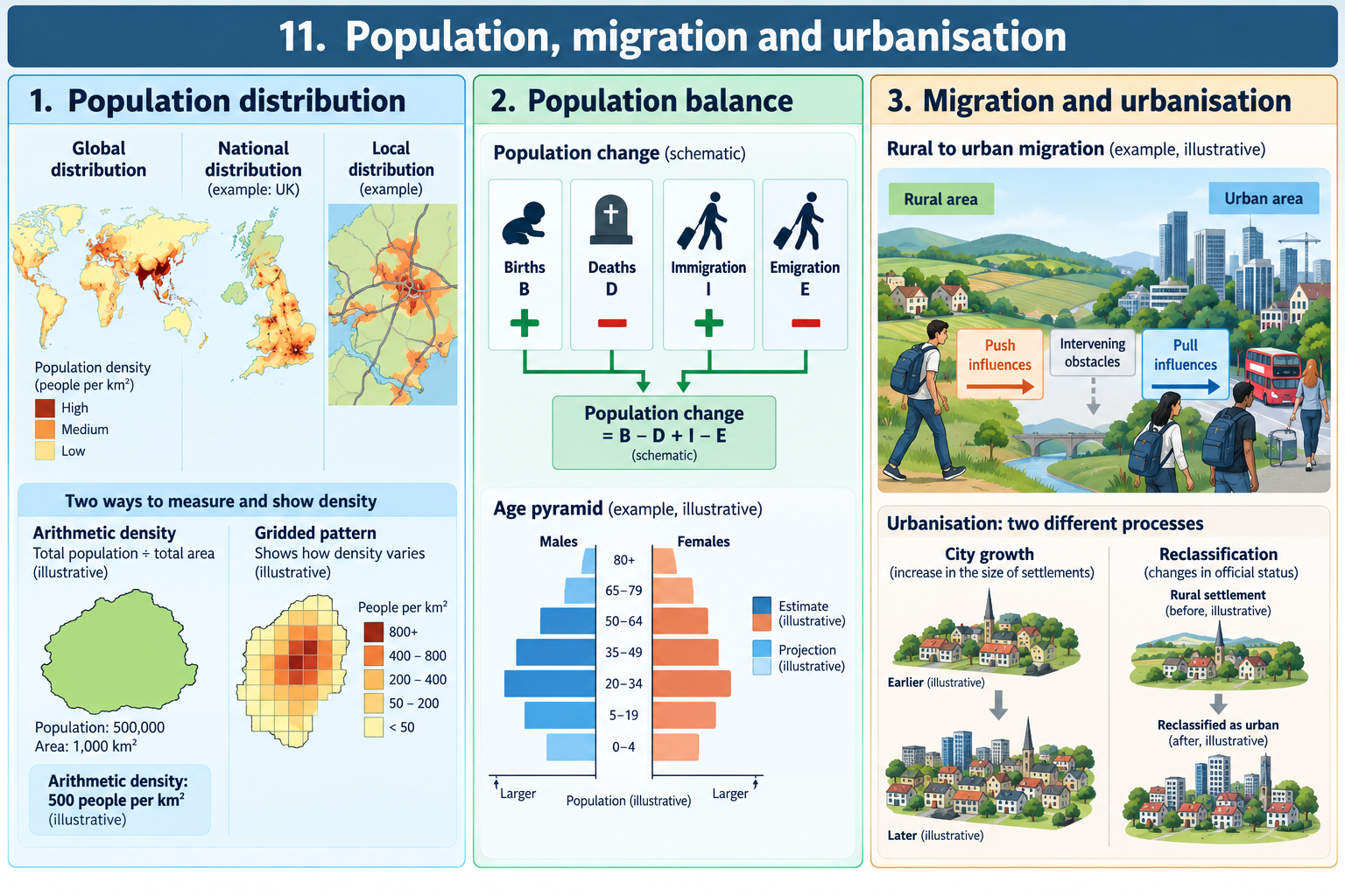
Key vocabulary
| Term | Meaning |
|---|---|
| population | People who live within a stated place and time definition. |
| population distribution | The pattern of where people live across an area. |
| population density | The number of people per unit of area, often people per square kilometre. |
| population structure | The composition of a population, often described by age and sex. |
| population change | Change in population size between two dates. |
| crude birth rate | Births per 1,000 people in a population during a stated period. |
| crude death rate | Deaths per 1,000 people in a population during a stated period. |
| natural change | Births minus deaths; it may be positive or negative. |
| immigration | Movement into a country or area to live, according to a stated duration rule. |
| emigration | Movement out of a country or area to live elsewhere. |
| net migration | Immigration minus emigration over the same time period and definition. |
| gross migration | Immigration and emigration counted separately before calculating a net balance. |
| internal migration | Movement from one area to another within the same country. |
| international migration | Movement across an international border, usually with a stated residence-duration rule. |
| push factor | A condition that may encourage a person to leave a place. |
| pull factor | A condition that may attract a person towards a place. |
| intervening obstacle | A cost, barrier or risk between a starting place and a possible destination. |
| voluntary migration | Movement involving meaningful choice, although choices may be constrained. |
| forced displacement | Movement where people are compelled or obliged to leave, for example because of conflict or disaster. |
| refugee | A person who meets the legal definition in the 1951 Refugee Convention and has crossed an international border. |
| internally displaced person | A person forced to leave home who remains within their country's borders. |
| urban | Classified as town or city under a stated national or international definition. |
| rural | Classified as countryside or lower-density settlement under a stated definition. |
| urbanisation | A rising share of a population living in urban areas. |
| urban growth | An increase in the number of people living in a defined urban place. |
| natural increase | Births exceeding deaths; in urban studies this can contribute to city population growth. |
| rural-to-urban migration | Movement from a rural area to an urban settlement. |
| suburbanisation | Growth of residential areas on or near a city edge, often with strong links to the city. |
| counter-urbanisation | Movement from a large urban area towards smaller settlements or rural areas. |
| urban sprawl | Outward, often low-density expansion of built-up land around a settlement. |
| reclassification | An administrative change in whether a settlement or area is classified as urban or rural. |
| population pyramid | A graph showing a population's age groups, often with males on one side and females on the other. |
| dependency ratio | A comparison of age groups defined as dependent with a selected working-age group; definitions vary. |
| ageing population | A population in which the older age groups form a greater share or number over time. |
| demographic transition model | A simplified model of how birth and death rates have changed during some countries' historical development. |
| megacity | A large urban settlement classed by a stated population threshold; the UN commonly uses 10 million residents. |
| net density | A density calculated for a defined developable or built area rather than the entire administrative area. |
| choropleth map | A map using colour classes to show a measured value across areas. |
| flow map | A map showing movement between places, often with arrows whose width represents a quantity. |
How the geography works
A population total is a count or estimate attached to a date, area and definition. Its spatial pattern is a separate question. Density divides a population count by area; distribution shows the locations of people and the spaces between them. Age structure describes how many people belong to selected age groups. Migration data describe movements, while migrant-stock data describe people living in a place who were born elsewhere or have another stated characteristic. These are different measures.
Population change is driven by births, deaths and migration. Natural change is births minus deaths. Net migration is arrivals minus departures. A place can have many arrivals and many departures at once, so net migration alone hides the size and composition of both flows. A city's population can rise through natural increase, movement into the city, changes to its boundary or classification, or a combination of these.
Urbanisation is a change in the proportion of people living in settlements classified as urban. It does not necessarily mean that every city is getting larger. A country's urban share can rise because towns and cities grow faster than rural areas, people move into urban places, rural settlements are reclassified, or the total population changes in different ways across settlement types. Always state the definition and the evidence before explaining a pattern.
1. Where people live: distribution and density
A pattern, not just a total
People are distributed unevenly across the world. Large concentrations occur around fertile plains, coasts, river valleys and long-established urban regions. Some places have few residents because steep relief, extreme temperatures, limited fresh water, difficult access or protected land uses restrict settlement. These are broad relationships, not rules that determine whether people can live in a particular place.
Physical conditions interact with history, technology, employment, transport, political decisions, culture and family connections. A dry region may contain a large city because water is transported, treated or stored. A cool upland area may support communities where roads, jobs and services connect it to other places. A coast may be densely settled in one country and sparsely settled in another because the coastline's role, hazards, infrastructure and economic history differ.
Population maps are selective representations. A world map can show national totals, density by grid cell, city locations or the percentage living in urban places; each answers a different question. A national average can obscure a capital city, remote islands, mountain valleys or a sparsely inhabited interior. A map of administrative regions may hide variation within each region.
Density calculations
The basic calculation is:
population density = population ÷ area
If a district has an estimated 240,000 residents and an area of 120 square kilometres, its arithmetic density is 2,000 people per square kilometre. This does not mean that people are spread evenly across all 120 square kilometres. The district may include a dense town, farmland, woodland and a reservoir.
Arithmetic density is useful for a first comparison if the population date, boundary and area units match. It becomes misleading when the shape or land use of two areas differs greatly. A mountain authority may appear sparsely populated because uninhabited uplands are included in its area. A coastal authority can include a wide sea area depending on its boundary definition. Built-up or residential density may answer a planning question better, but the definition must be stated.
Counts and rates can tell different stories. A city of five million may add 50,000 people, while a town of 100,000 adds 5,000. Both have grown by one per cent, despite very different numerical increases. To compare pace fairly, calculate percentage change:
percentage change = (later total − earlier total) ÷ earlier total × 100
For example, growth from 100,000 to 105,000 is 5 per cent. Growth from 5,000,000 to 5,050,000 is 1 per cent. State whether you are comparing the number added or the percentage increase. A high percentage can arise from a small starting population and does not automatically mean that a place has the largest population.
Scale and boundaries
Population data are collected for areas such as countries, regions, local authorities, neighbourhoods and grid cells. Boundaries can change when administrative areas are reorganised. A growing built-up settlement can cross several local-authority boundaries, while the official city total may use a separate definition. Compare areas with care and check whether their boundaries are stable through time.
The modifiable areal unit problem is a technical name for a basic map issue: patterns can look different when the same data are grouped into differently sized or shaped areas. A small neighbourhood map may reveal local inequality that disappears in a region-wide average. Conversely, very small areas can make random yearly variation look dramatic. Choose a scale that fits the question and avoid drawing conclusions from boundaries that were selected for another purpose.
Reading a density map
Before describing a choropleth:
- Read its title and identify the population measure.
- Note the reference date and the area units.
- Read the legend and class breaks.
- Locate the densest and sparsest areas.
- Describe a pattern with direction or named places.
- Ask whether each mapped class shows a count, rate or percentage.
- Identify variation hidden within each mapped area.
- Suggest possible explanations, then separate those hypotheses from what the map directly proves.
A map may use classes such as 0–50, 51–100 and 101–200 people per square kilometre. If one area has a value of 101 and another 200, both share a colour even though their densities differ. If classes have unequal intervals, visual colour differences do not correspond to equal numerical differences. Check the scale and legend instead of estimating exact values from shades.
2. How populations change
The population balance
For a defined area over a stated period:
population at end = population at start + births − deaths + immigration − emigration + other adjustments
This is a balancing framework, not a complete explanation. Estimates may include revisions, changes in definitions, people missed by a census, or other adjustments. A useful answer identifies the components that matter in the particular dataset.
Natural change is births minus deaths. If there are more births than deaths, natural increase adds to the population. If deaths exceed births, natural decrease reduces it. Natural change depends on the size and age composition of the population as well as rates. A large country with a modest birth rate may record more births than a small country with a high birth rate.
Migration changes the population through both arrivals and departures. Net migration is the difference between them. If 30,000 people arrive and 24,000 leave, net migration is positive 6,000, but gross movement totals 54,000. A small net figure can therefore coexist with considerable movement in both directions.
The rate of change is usually more useful than a raw total when comparing unequal populations, but a rate needs a denominator and a period. Annual population growth rates are commonly expressed as a percentage of the population at the start of the year or by a defined statistical method. Do not mix annual rates with ten-year totals.
Dated UK evidence
The ONS mid-2024 estimates placed the usual-resident population of England and Wales at 61,806,682, around 61.8 million. This was 706,900, or 1.2 per cent, above the mid-2023 estimate. The ONS reported that estimated net international migration of 690,100 was the largest component of increase for the year to mid-2024; natural change added 30,000. The numbers were subsequently subject to revisions and describe England and Wales, not the whole United Kingdom.
In the same ONS release, 596,000 births and 566,000 deaths contributed to natural increase. England gained 687,600 residents (1.2 per cent) and Wales 19,300 (0.6 per cent). Across English regions, growth rates lay between 1.0 and 1.4 per cent; the North West had the highest rate and London and the South West the lowest. These figures illustrate why a national increase does not mean every part grew at the same pace.
The ONS also reported that population increased in 306 of 318 local authorities in England and Wales in the year to mid-2024. The highest local-authority growth rates included the City of London, Oadby and Wigston, and Preston; the ONS cautions that very small populations can produce outlying percentage changes. A map using only percentage growth could make a small authority appear more dramatic than a much larger place with a bigger numerical addition.
Treat these values as a dated case, not as figures to repeat indefinitely. Statistical agencies revise estimates when better migration data arrive or methods improve. A student should record the release date and reference period, identify which countries are covered, and use the latest comparable series available for a current assignment.
Natural change and the age structure
Birth and death rates are influenced by many factors. Fertility can be associated with access to healthcare, education, housing, employment, contraception, cultural expectations, child survival and the costs of raising children. Life expectancy can change with health services, living conditions, public health, conflict, work risks and many other conditions. No single factor explains a national rate.
Age structure matters because age groups have different probabilities of being born, dying, studying, working or moving. A population with a larger number of people of childbearing age may have more births even if each person has fewer children on average. A population with many older residents may record more deaths even as people live longer. Rates should therefore be interpreted alongside the population's structure.
A young population may create demand for schools, childcare, health services, jobs and later housing. An ageing population may increase demand for accessible housing, healthcare and transport, while older residents also contribute skills, care, taxes, community work and spending. These are planning questions, not evidence that one age group is a burden or that all people in the same age bracket have the same needs.
Population pyramids
A population pyramid usually displays age groups on the vertical axis and population count or percentage on the horizontal axis. One sex is shown on each side in many conventional diagrams. The graph can show a broad base, a narrow base, a large working-age group or a bulge in particular cohorts. A broad base often reflects more births in recent years, but changes in deaths and migration can also shape the form.
Read the title and date first. Check whether the bars show counts or percentages. Counts answer “how many people?”; percentages answer “what share of the population?”. If comparing two places of very different size, percentages reveal shape more fairly, while counts show service demand. A five-year age band contains more people than a single-year group if values are not standardised, so verify the intervals.
Each bar represents a cohort: people born during a similar period. A bulge can move upwards over time as the cohort ages. It may reflect an earlier birth increase, migration of people at particular ages, or the way age bands are defined. A dip can reflect fewer births, mortality, emigration or a disruption. Do not label a feature as the result of a war, baby boom or migration without checking the timeline and other evidence.
Population pyramids also have limits. A snapshot does not show why the age structure formed, where within a country people live, or how households are arranged. Some datasets have two broad sex categories and cannot represent every person's identity. A pyramid should be one piece of evidence alongside time series, migration data and place knowledge.
Compare age structures and estimate planning pressure
Compare two pyramids by checking the same age bands, date and units, then identify which cohorts differ most. A wide base in one place and a wider older population in another may imply different service priorities, but the graph is a starting point for questions rather than a complete budget plan. Local access, household income, health, school capacity and movement between districts also matter.
An age-dependency ratio is often calculated as the number of people in age groups conventionally classed as dependent divided by the population of conventional working age, then multiplied by 100. A common version compares ages 0–14 and 65+ with ages 15–64, but the published definition should always be checked. For a hypothetical place with 24,000 people aged 0–14, 60,000 aged 15–64 and 16,000 aged 65+, the ratio is (24,000 + 16,000) ÷ 60,000 × 100, or about 67 people in the two dependent age groups per 100 people of working age.
This is a demographic ratio, not a count of people who need care or a measure of how many residents work. Some people over 65 are employed or provide unpaid care; some working-age residents study, are unemployed or have care needs; children have different needs at different ages. A useful planning interpretation specifies the service and location: a larger child cohort may increase demand for primary-school places, while a growing older cohort may raise the need for accessible transport or local health services. Check school rolls, health indicators, household data and service locations before claiming a specific shortfall.
Age structure can also be mapped within a city. A national average can hide neighbourhoods with many young families, students or older residents. Compare rates with their denominators and boundaries, and avoid inferring an individual's age or circumstances from the area average. For a strong answer, connect the pyramid's visible shape to a carefully qualified service question and identify the additional evidence needed to plan fairly.
The demographic transition model: use it as a model
The demographic transition model (DTM) is a simplified way to describe long-term shifts in birth and death rates associated with social and economic change. In a common version, a society moves from high birth and death rates, to falling death rates while births remain high, then to falling births, and later to relatively low birth and death rates. Some diagrams add a possible stage of natural decrease.
The model can help students ask questions. Why might death rates fall before birth rates? How could access to clean water, nutrition, vaccination or healthcare affect survival? How might education, housing, changing employment or family planning relate to fertility? How does the balance between births and deaths alter natural change? It is a framework for investigation, not a clock that every country follows at the same speed.
The model has important limits. It was built from selected historical experiences and can imply a single route of development. Countries and regions have different histories, policies, age structures, health transitions and migration patterns. A national curve hides differences among groups and places. Recent shocks, changing fertility, conflict and new migration can disrupt a pattern. The DTM does not explain urbanisation by itself and does not replace actual data.
Use a DTM with a named source, dates and a clear caveat. If a country's birth rate falls, do not infer that every family has fewer children by the same amount. If its total population continues to rise, consider age structure and population momentum: a large young cohort can contribute births for decades. Relate the model to observed evidence instead of assigning a country to a stage as if that were a permanent label.
3. Migration: people, decisions and flows
What is migration?
Migration describes movement from a usual place of residence to another place, using a stated definition of what counts as a move and how long a person must stay. A daily commute, holiday trip or temporary visit is usually not counted as long-term migration, although other datasets may record different kinds of movement.
Internal migration occurs within a country. It includes a move between regions, cities, towns or neighbourhoods. International migration crosses a national boundary; definitions often set a minimum length of stay. A person can move more than once, return later or maintain strong relationships with a place of origin. “Migrant” is a broad descriptive term and does not by itself say why a person moved or what their legal status is.
Migration can be voluntary, forced or somewhere between those categories. Some people plan a move for work or study; others leave because staying has become dangerous or impossible. Even apparently voluntary decisions may be limited by income, caring responsibilities, visas, discrimination, available transport or access to information. Avoid writing that everyone can simply choose where to live.
Forced displacement includes people who must leave their homes because of conflict, persecution, violence, disasters or other serious threats. A refugee has crossed an international border and meets a specific legal definition. An internally displaced person has been forced to move but remains within their country. These terms are not interchangeable. A person displaced by a flood is not automatically a refugee under the 1951 Refugee Convention.
Push and pull influences
Push and pull is a useful classroom frame, but it simplifies complex decisions. A push factor can make a place less safe or attractive; a pull factor can make another place seem to offer opportunity. The same condition may play both roles. A job may pull someone to a city while a lack of jobs pushes them from their original settlement. Family connections can attract someone to a destination and support others to remain.
Possible influences include:
- Economic: wages, job availability, land access, cost of living, employment security and the possibility of supporting relatives.
- Social: family, education, health services, safety, community links, language and cultural connections.
- Political: conflict, persecution, changes in rights, insecurity or government policy.
- Environmental: drought, flooding, soil degradation, pollution, hazards or changes to a livelihood based on land or water.
- Personal and life-course: study, partnership, retirement, caring, health or a desire for a different environment.
These categories overlap. Drought may reduce harvest income; loss of income may make school fees unaffordable; a family member may move to a city and provide a route for another relative to join them. The physical event alone does not determine the outcome. Access to money, transport, land, social support and safe alternatives affects whether a person can move, where they can go and whether they can return.
Intervening obstacles and migration selectivity
People rarely choose between a starting place and a distant destination without constraints. Travel cost, visas, border rules, information, housing, language, caring duties, health and safety can all restrict movement. A nearer destination may be more feasible even if a farther place appears to offer greater opportunity. Some people move in stages, returning home, or circulating seasonally.
Migration is selective: migrants are not a random sample of everyone in a place. Age, education, family stage, income, health, gender, legal status and social networks can shape the likelihood and type of movement. A study should ask who moved and who could not, not only how many people arrived.
Migration streams can create feedback. People who arrive may share information and contacts with relatives or friends in their previous place. Networks can lower uncertainty or help people find accommodation and work. In turn, established communities can influence where future migrants settle. A flow map shows direction and quantity but rarely captures all of these relationships.
Effects differ by person and place
Migration can benefit people who gain safety, education, income, family unity or more control over their lives. A receiving place may gain workers, skills, students, cultural connections, business activity and new demand for services. People who leave may send remittances or develop knowledge they later bring back.
There can also be costs and pressures. A migrant may face exploitation, unsafe housing, uncertain legal status, discrimination or separation from family. Rapid change in a receiving area can add pressure where housing, classrooms, healthcare, water or transport capacity is limited. The relevant issue may be planning, investment or unequal access, not the existence of migrants as a group.
Places of origin can lose workers or people with particular skills, while remittances and reduced competition for limited jobs may benefit households. A family can have both gains and losses. Effects vary by who leaves, who stays, local labour demand, public services and government policy. Avoid broad claims such as “migration is good” or “migration is bad” without identifying the group, scale and evidence.
Describing a migration flow accurately
When interpreting a flow map or migration table:
- Identify the origin and destination and state whether the flow is internal or international.
- Read the period and residence definition.
- Check whether the map gives gross arrivals, departures, net migration or a migrant stock.
- Note the units and population denominator.
- Describe the size and direction of the flow, not a cause the map cannot show.
- Use another source, such as survey evidence or policy information, to investigate motives.
- Separate correlation from causation and identify what remains unknown.
Suppose a diagram shows a thick arrow from rural district A to city B. It can support the description that the mapped flow is larger than another flow if the legend confirms arrow width represents movement. It cannot prove that employment caused the move, that all movers were young, or that every resident of district A wants to leave. Those claims need evidence that the map does not contain.
4. Urbanisation and urban growth
Definitions matter
An urban settlement is defined differently across countries. Some national statistical systems classify an area using administrative boundaries or local population thresholds. The United Nations' World Urbanization Prospects 2025 uses a harmonised Degree of Urbanization for comparisons: it groups mapped cells into cities, towns and semi-dense areas, or rural areas, using population density, size and contiguity. National definitions can produce different urban shares for the same country.
Urbanisation means the percentage or share of people living in areas classed as urban rises. It does not necessarily mean that every city is getting larger. A country's urban share can rise because towns and cities grow faster than rural areas, people move into urban places, rural settlements are reclassified, or the total population changes in different ways across settlement types. A city can grow in population while the national urban share falls if rural population grows faster.
The UN's 2025 assessment estimated that cities were home to 45 per cent of the global population of 8.2 billion in 2025. Its headline results project that two-thirds of global population growth through 2050 will occur in cities, with most of the remaining growth in towns. These are global estimates using harmonised categories and projections, not a claim that each city will grow in the same way.
Why urban places grow
Urban growth can result from rural-to-urban migration, international migration, natural increase, administrative reclassification or a change in the boundary used to define the city. These influences can operate together. A city may attract people for study or employment while having a young age structure that contributes to natural increase. Another city may have many international arrivals but also high emigration or low natural increase. To explain its total change, use component data if available.
Some textbooks describe rural-to-urban migration through push and pull influences. On the rural side, seasonal work, limited services, land pressure or environmental risk can contribute to decisions to move. In the city, education, healthcare, wages, transport or family networks may draw people. The connection is not mechanical: people may have multiple destinations, may choose a town instead, or may stay in a rural area because of family, livelihood, costs or preference.
Urbanisation is not the same as suburbanisation
Suburbanisation is the growth of residential areas on or near the edge of a city. People may move outward for housing, space, schools or access to green areas while commuting to central employment. Improved roads, rail or bus routes can extend the area linked to a city. Some new suburbs contain local jobs and services; others depend strongly on the central city.
Counter-urbanisation describes movement away from a large city towards smaller towns or rural areas. It can be associated with remote work, retirement, housing cost, lifestyle or environmental preference, but patterns differ by country and time. Some people move out while others move in. A city-region can continue to grow overall even if some central districts lose population.
Urban sprawl is outward expansion of built-up land, often at low density. It can replace farmland or habitats, increase travel distances and make infrastructure expensive. However, new development can also provide homes, services and employment. Outcomes depend on its location, design, transport options, housing affordability and environmental safeguards.
Urban opportunities and pressures
Urban places concentrate people, services and connections. This can support universities, hospitals, public transport, cultural activity, specialised work and social networks. A larger labour market can help employers find workers and workers find jobs. Dense settlement can make some services or transit systems practical, although high density alone does not ensure equal access or good quality.
Concentration can also intensify competition over land and infrastructure. Housing costs may rise faster than incomes; overcrowding can affect health and study; traffic can slow travel and create pollution; paved surfaces can increase rapid runoff; and high demand can strain water, energy or waste systems. The impact varies across neighbourhoods and groups. A new station may improve access for one community while rising property costs displace some renters nearby.
Some challenges occur because the number of people changes quickly relative to service capacity. A city can have a large population and strong resources yet still contain severe inequality. A smaller settlement may have a lower density but long journeys to healthcare or education. Compare access and quality, not simply how many buildings or residents a place contains.
Planning decisions influence how growth is accommodated. Housing can be built through infill, brownfield regeneration, taller buildings, new settlements or outward expansion. Each approach affects land, infrastructure and communities differently. A student evaluating a plan should identify the location, who needs housing, who benefits, what transport is available, how services will be funded, and what environmental effects are likely.
Read a city-growth explanation as a sequence
A useful explanation follows the process rather than attaching one label to a map:
- State what changed. Give a population count, rate or mapped change with dates.
- Separate the components. Check natural change, internal migration, international migration and any boundary or classification change.
- Identify the scale. Ask whether the total refers to a built-up area, an authority, a region or a grid-defined city.
- Explain the link. If jobs are proposed as a reason, show how employment connects to movement or births. A correlation is only a starting clue.
- Trace the effects. Consider housing, employment, transport, health, education, water and environmental systems.
- Compare who experiences them. An owner, renter, commuter, new arrival, long-term resident and local business may have different outcomes.
- Reach a qualified conclusion. State what the evidence supports, what it cannot show, and which additional data would improve confidence.
For example, a new university can attract students and workers, stimulate cafés and housing development, and increase demand on buses or rented accommodation. If existing residents are priced out, that is not an automatic consequence of migration; it depends on how many homes are available, tenancy protections, incomes, investment and planning. Local rent data, student enrolment, new-home completions and travel patterns would help test different parts of the explanation.
City regions and daily connections
The boundary of a city is not always the boundary of people's daily lives. People may live in a neighbouring town, travel into the central city for work, study or healthcare, and use services in several districts. A functional urban area can include a dense centre plus its commuting zone. A built-up-area measure may show a continuous spread of development; an administrative city may follow a historic boundary; a metropolitan authority may govern a much wider territory.
These geographies answer different questions. Planners may need commuting flows and transport connections. Public-service teams may need population by age in neighbourhoods. A national comparison may use a common grid method. Before explaining urban growth, identify the spatial unit in the source, then ask whether it suits the question. If a settlement has grown beyond an old boundary, the official total might understate its connected urban region.
Urban and rural are also not opposite ends of a simple lifestyle scale. Towns, suburbs, small cities, villages and dispersed settlements form a continuum of densities and connections. A rural household may depend on a nearby city for a hospital or college. An urban neighbourhood may contain parks, farms at its edge and strong local networks. Describe the measurable settlement pattern rather than using assumptions about the people who live there.
A worked reading of the dated evidence
Take the ONS estimate for England and Wales between mid-2023 and mid-2024. First, state the population change: the estimate rose by about 706,900, or 1.2 per cent, to 61.8 million. Next, inspect the components: the release attributed most of the increase to net international migration and reported positive natural change. It also recorded differences by country and region. Finally, note the limit: this all-England-and-Wales balance does not reveal the destination neighbourhoods, the age or circumstances of every mover, nor the pressures on a specific city service.
Now compare that national figure with the UN's global urban share for 2025. The ONS total covers residents of England and Wales across rural and urban places; the UN statistic is the proportion of the world population living in categories classified as cities under a harmonised method. One is a population total and annual change for two countries; the other is a global percentage for settlement categories. It would be incorrect to put them in a single league table or infer that one demonstrates the other.
A useful student conclusion is narrower: the dated ONS release shows that international migration was the largest reported contributor to population growth in England and Wales over that year, while UN estimates show cities held a substantial share of the global population in 2025. Neither source on its own establishes that all arrivals went to cities or that migration was the only driver of urban growth. For that, use subnational migration flows, city boundaries, natural-change data and an explicit urban definition.
Place example
This comparison combines a global urban estimate with UK population evidence. Because the measures use different scales and definitions, it is a lesson in careful comparison as well as a place study.
Global city populations: what the 2025 UN evidence says
The UN's World Urbanization Prospects 2025 provides estimates for cities, towns and rural areas across countries for 1950–2025 and projections to 2050. Its Degree of Urbanization offers a common spatial method for international comparisons. The method matters: a city defined as a continuous densely populated grid may have a different population from a municipal authority or a metropolitan commuting region.
The UN summary estimated that the population living in cities had risen from 20 per cent of the world's 2.5 billion people in 1950 to 45 per cent of 8.2 billion people in 2025. It also identified 33 megacities in 2025, using a threshold of at least 10 million residents. These comparisons indicate a large long-term shift towards city living, but do not mean all urban residents live in megacities. Most cities are much smaller.
Jakarta was estimated to have nearly 42 million residents in 2025 and Dhaka almost 40 million in the UN report. These figures use the report's city methodology; they should not be swapped with values from a national census or a metropolitan authority without checking boundaries. In a school case study, use the settlement definition and date selected by your teacher. The purpose of the comparison is to understand scale, growth and planning needs, not to rank places as successful or unsuccessful solely by population.
What causes city growth?
A city's growth reflects its own context. Work, education, transport, family networks, housing, safety and access to services can influence migration. Natural increase and the settlement's existing age profile also matter. Boundaries may be altered, and nearby settlements may merge into a wider built-up region. Each mechanism should be checked rather than inferred from a large population total.
Rapid growth can create demand for housing, water, sanitation, transport, schools and healthcare. If investment keeps pace, a city may extend services and economic connections. If provision lags, people can face insecure housing, long journeys, congestion or inadequate drainage. “Slum” is a broad and potentially stigmatising term; where a source uses a formal housing or service definition, state that definition and describe the actual conditions rather than labelling residents.
City growth also produces opportunities: larger markets, diverse work, education, public transport and cultural life. Informal employment and neighbourhood networks may provide livelihoods and support, although workers can lack secure pay or protection. Outcomes differ across city districts and households. A citywide average conceals who has piped water, who lives near a flood channel, who spends hours commuting and who can afford to move.
England and Wales: a dated regional comparison
The ONS mid-2024 release offers a comparison at national, regional and local-authority scales. England's population grew by 1.2 per cent and Wales's by 0.6 per cent in the year to mid-2024. Within England, regional growth rates fell between 1.0 and 1.4 per cent. The North West recorded the highest regional rate; London and the South West recorded the lowest. This is a comparison of regions over one year, not a long-term forecast and not a direct measure of urbanisation.
Local variation was wider: 96 per cent of local authorities grew, but some fell. The ONS noted that the City of London and Isles of Scilly have small populations, so an unusual movement can produce a large percentage change. That is a useful lesson in interpreting rates. The City of London is not equivalent in size or function to the wider London urban area, and a local-authority boundary is not automatically a city boundary.
The ONS release reported net international migration as the largest contributor to England and Wales population growth in the year to mid-2024. The component does not tell us where every migrant settled, their reasons for moving or the local effect on housing and services. Those questions need finer-grained data and careful qualitative evidence.
This example does not label London a “fast-growing city” against a region based on those one-year figures: the regional data in the release show London among the slowest-growing English regions. For a city-versus-region comparison, define the city and region, select a common time interval, and compare population change rates using compatible boundaries. A defensible conclusion may be that the broader region grew more quickly in that particular year; explain the scale difference and avoid extrapolating from one observation.
An evidence-based comparison template
For any pair of places, make a table with:
| Comparison item | Place A | Place B | Why it matters |
|---|---|---|---|
| Definition and boundary | City, local authority, grid settlement or metro area? | Region, district or rural area? | Population totals only compare fairly when the areas are understood. |
| Dates | Which start and end dates? | The same dates if possible? | A single year can differ from a decade-long pattern. |
| Count | How many residents? | How many residents? | Shows scale, but not pace by itself. |
| Rate | Percentage or annualised rate? | The same type of rate? | Allows a fairer comparison of differently sized populations. |
| Components | Births, deaths, arrivals, departures, boundary changes? | Same components available? | Explains mechanisms rather than just describing a result. |
| Age structure | Which cohorts are large? | Which cohorts are large? | Helps interpret natural change and service demand. |
| Internal pattern | Which neighbourhoods gain or lose? | Which districts gain or lose? | Avoids treating a whole place as uniform. |
| Data limits | Revisions, missing data, estimates or projection? | Same limitations? | Sets the confidence and scope of the conclusion. |
If data are not comparable, say so. Use each source to answer the question it can answer and identify what additional evidence is required. A strong geography explanation might connect new employment and transport to arrivals, then explain how housing supply and planning shape where new residents live. It should not claim every migrant came for work or that growth automatically causes overcrowding.
Maps, data and evidence
Select a useful source
Population evidence can come from a census, mid-year estimate, administrative data, household survey, migration record, satellite grid or projection. A census counts people and households using a national method at a specified point or period. Annual estimates update totals between censuses. Migration measures may use surveys, records or statistical models. Satellite and grid products estimate where people are located, but they may miss informal dwellings or rely on assumptions.
A projection applies assumptions about future fertility, mortality and migration to a starting population. It answers “what if these assumptions continue?” rather than “what will definitely happen?” If assumptions change, projections change. Cite the projection base year, time horizon and scenario. Never describe an official projection as a guaranteed prediction.
Population change calculation
Example using a fictional district:
| Measure | Earlier year | Later year |
|---|---|---|
| Population | 80,000 | 84,000 |
| Births during the interval | 1,300 | — |
| Deaths during the interval | 900 | — |
| Arrivals | 2,400 | — |
| Departures | 1,000 | — |
The total rises by 4,000. The percentage increase is 4,000 divided by 80,000, multiplied by 100, giving 5 per cent. If the four component counts refer to precisely the same interval and definitions, natural change is 400 and net migration is 1,400. These explain 1,800 of the 4,000 rise; the remaining difference could include other adjustments, boundary changes, coverage differences or inconsistent dates. Do not invent a cause for the unexplained balance. Check the source notes.
The example uses invented numbers only to teach calculation. It is not evidence about a real settlement. In a real response, state the actual units, dates and method. If a table provides population totals but not components, describe the change and state that the totals alone cannot identify its cause.
Population pyramids in practice
Read the title, date, age intervals and unit before interpreting the shape. Describe a broad pattern, then select a feature and explain what further evidence could test an explanation. If a pyramid has a wide 20–34 band, a possible explanation could be migration of young adults for study or work. To test it, compare birthplace, reason-for-move, student status and earlier age structure data; shape alone cannot prove the cause.
When comparing pyramids, verify that both use the same age bands and measure. A population count is not directly comparable between a large and small country. Percentages improve shape comparison, but a similar proportion can still mean very different numbers of people. Mention both if the task asks about service demand.
Flow maps and migration tables
Arrow width should follow the legend. A map with thick arrows may show origin-to-destination flows, but verify whether flows are counts, rates or net movement. Negative net migration may coexist with high arrival and departure totals. A map of foreign-born residents shows a population stock at a date; it does not show when or why people arrived.
Use careful verbs: “the table records,” “the map shows,” “the estimate suggests.” Use “because” only when causal evidence supports it. You can propose an explanation with cautious language and then name the additional evidence needed to test it.
Urban maps and land-use evidence
Satellite images can show built-up expansion, but dates, sensor resolution, seasonal conditions and classification methods matter. A settlement edge may be difficult to define where buildings, roads, villages and fields form a gradual transition. A photograph shows one view and date; a land-use survey can add local detail but covers only sampled sites.
Use paired maps or images at the same scale to trace expansion. Mark built-up areas with a consistent key and locate transport lines, rivers, flood zones or protected habitats. Do not assume a new road caused expansion merely because both appear on a later map. Planning documents, building records and travel data would help explain the relationship.
Rates and percentages
A rate uses a denominator; a percentage change uses a starting value. State the period and denominator whenever available. A smaller settlement can have a bigger percentage rise from a small base, while a larger city adds more people overall. A low or negative net migration rate does not mean no one moves; arrivals and departures could both be high.
Check whether the denominator is total population, working-age population, households or land area. “Births per 1,000 people” and “births per 1,000 women aged 15–49” measure different things. These calculations are not interchangeable. Read the data definition before comparing.
Common misconception
- “Population density tells me exactly where everyone lives.” It is an average for an area. Grid maps or local data reveal internal patterns.
- “A large population must be growing fastest.” Total size and rate of increase are different measures.
- “Net migration is the number who arrived.” It subtracts departures from arrivals; gross arrivals and departures can both be large.
- “Migration only means crossing a national border.” Internal movement can happen between neighbourhoods, regions and rural or urban places.
- “Push and pull factors explain every migration decision.” They are a starting framework. Constraints, social networks, personal circumstances and legal rights matter.
- “Everyone forced to move becomes a refugee.” Refugee has a legal definition involving crossing an international border; internally displaced people remain within their country.
- “Urbanisation means every city is expanding.” It is the change in urban share for a defined population. Individual cities can grow, stagnate or shrink.
- “Urban growth is caused only by rural-to-urban migration.” Natural increase, international migration and reclassification can contribute.
- “Every person who moves to a city finds a job and better housing.” Outcomes depend on skills, rights, housing supply, discrimination, services and opportunity.
- “A population pyramid reveals why the population has its shape.” It shows age structure, not the causes. Use additional evidence.
- “A model stage is a label for a whole country forever.” The demographic transition model is a simplified historical framework. Countries and regions change differently.
- “A projection is a prediction.” A projection is conditional on assumptions; it must be read as a scenario.
- “Rural means empty and urban means modern.” Both rural and urban places are diverse and connected; classification describes settlement patterns, not a value judgement.
Self-check
- What is the difference between population distribution and population density?
- A district contains 90,000 people and covers 30 square kilometres. Calculate its arithmetic density.
- If a population rises from 200,000 to 210,000, what is its percentage change?
- Write the population balance equation using births, deaths, immigration and emigration.
- How do natural change and net migration differ?
- A place has 50,000 arrivals and 48,000 departures in a year. What is its net migration, and what important fact would that net figure hide?
- Why should the date and boundary accompany a population total?
- What does a population pyramid show, and what can it not prove?
- Give one reason why a cohort might appear unusually large in a population pyramid, and name evidence that could test the explanation.
- State one limitation of the demographic transition model.
- How does internal migration differ from international migration?
- Explain the difference between a refugee and an internally displaced person.
- Give two interacting reasons a person might move to an urban area.
- Name one intervening obstacle that can affect a migration decision.
- How might a migration flow benefit a destination and also create a planning challenge?
- Explain why a rural origin place can experience both loss and benefit when residents move away.
- What is the difference between urbanisation and urban growth?
- Name three processes that could increase an urban population.
- Give one way suburbanisation differs from counter-urbanisation.
- Why can two UN and national definitions of “urban” produce different urban population shares?
- The 2025 UN assessment estimated 45 per cent of the world's population lived in cities. What date and definition should accompany this figure?
- Why does a high percentage increase in a small local authority need cautious interpretation?
- What information should you check before comparing two population pyramids?
- Does an arrow on a migration map prove why people moved? Explain your answer.
- If urban land expands on a satellite image, what additional evidence could help explain why?
Answers and reasoning
- Distribution describes the spatial pattern; density is a number of people per unit of area.
- 90,000 divided by 30 = 3,000 people per square kilometre. It is a mean for the defined district, not a claim of even spread.
- The increase is 10,000; 10,000 divided by 200,000, multiplied by 100, gives 5 per cent.
- Ending population = starting population + births − deaths + immigration − emigration + any stated adjustments.
- Natural change is births minus deaths. Net migration is arrivals minus departures.
- Net migration is +2,000. It hides 98,000 gross movements and the characteristics or reasons of the people who moved.
- A total can change with time, measurement rules and boundary coverage; without these it cannot be interpreted fairly.
- It shows age groups and often sex structure at a date. It does not alone show causes, neighbourhood pattern or household conditions.
- A cohort may reflect earlier birth numbers or age-selective migration. Compare earlier pyramids, birthplace and migration data, and cohort changes over time.
- It simplifies varied country histories into a common sequence and may imply a single pathway. It should be checked against place evidence.
- Internal migration occurs within a country's borders; international migration crosses a national border under the dataset's residence rules.
- A refugee crosses a border and fits an international legal definition; an internally displaced person remains within the same country after forced movement.
- For example, a person may be attracted by work and family networks while also leaving an area with fewer services. Use a named context rather than assuming motives.
- Cost, visas, care responsibilities, transport, safety, housing and health can constrain a move.
- A destination may gain workers or skills, while rapid demand can challenge housing or services if provision does not keep pace.
- The origin may lose workers but receive remittances, new skills, reduced competition for land or income diversification. Who leaves and who stays matters.
- Urbanisation is a rising urban share; urban growth is an increase in the number of people within a defined urban area.
- Migration into the city, natural increase, boundary growth or administrative reclassification.
- Suburbanisation expands housing near the edge of a city; counter-urbanisation describes movement away from a large urban area toward smaller settlements or rural places.
- Their thresholds, boundary methods and use of population density or administrative status can differ.
- The estimate is for 2025 and the UN's harmonised Degree of Urbanization; its method differs from some national definitions.
- A small starting population means a relatively small count can produce a large percentage. Check both counts and rates.
- Dates, age intervals, sex categories, units and whether values are counts or percentages.
- No. An arrow can show a recorded direction and quantity if its legend says so; it does not necessarily measure motives.
- Compare dated land-use maps, planning decisions, housing construction, transport links and local population data.
Revision points
For population questions, identify the place, scale, date and measure before explaining a pattern. Use counts for the size of a population, rates for fairer comparisons and maps for internal distribution. Explain changes through births, deaths and gross movements as well as net balances; check boundary and definition changes.
For migration, describe the origin and destination, classify the movement, and then weigh possible influences against constraints and personal circumstances. Discuss consequences for specific groups in both places. Avoid assuming all moves are either fully voluntary or wholly forced.
For urbanisation, keep the urban share separate from the total city population. Explain migration, natural increase and classification changes, then consider housing, services, jobs, transport and environmental systems. A city average can hide sharp neighbourhood differences.
Use a claim–evidence–explanation structure. Name the data source and year. Distinguish an estimate from a projection, a pattern from a cause, and an illustrative case from a universal rule. On a longer answer, state who benefits, who faces costs, at what scale and over what time period.
Curriculum alignment
- Curriculum coverage IDs: ks3.human.population-urbanisation, ks3.place-knowledge
- Related practice packs: ks3_geography_population_migration
- Shared concept tags: population, migration, urbanisation, demography
Sources
- Curriculum: Department for Education: England Geography programme of study
- UK population evidence and component changes, mid-2024: Office for National Statistics: Population estimates for England and Wales, mid-2024
- UK population estimate definitions and methods: Office for National Statistics: Population estimates for England and Wales, mid-2024 methods guide
- Conditional UK population projection scenarios: Office for National Statistics: National population projections, 2024-based
- Urban definitions, global estimates and projections: United Nations DESA: World Urbanization Prospects 2025
- Global city shares and megacity summary: United Nations: Cities are home to 45 per cent of the global population
- Urban, town and rural definitions: United Nations DESA: World Urbanization Prospects glossary
- Migration terminology: International Organization for Migration: Glossary on Migration
- Refresh statistics before assessment use. The figures above are dated examples, not a substitute for a current release or a teacher's selected place study.