 FoxChild@Learn
21. Geographical skills
Curriculum status: Required core content.
This guide follows AQA GCSE Geography 8035. Named examples below are suggested teaching examples where the specification allows a school choice; use your teacher’s selected case study and verify current figures before an assessment.
Required knowledge
- Apply cartographic, graphical, numerical and statistical skills across physical and human geography.
- Interpret OS maps, atlas maps, photographs, GIS, satellite imagery, graphs, tables and written sources.
- Use scale, direction, grid references, units, data presentation and evidence-based communication accurately.
Key vocabulary
| Term | Meaning |
|---|---|
| contour | line joining points of equal height |
| gradient | change in height divided by horizontal distance |
| mean/median/range/quartiles | measures of central tendency and spread |
| percentage change | change relative to starting value |
| GIS layer | mapped dataset that can be viewed with other spatial information |
| interquartile range | spread of the middle half of ordered values |
How the geography works
Choose the skill to match the task: use latitude/longitude and four/six-figure grid references; measure straight/curved distance and area at map scale; interpret direction, contours, spot heights, gradient, transects and cross-sections; read ground, aerial and satellite photographs and GIS layers; construct line, bar, pie, histogram, scattergraph and population-pyramid displays; complete choropleth, isoline, dot, desire-line, proportional-symbol and flow-line maps. Calculate ratios, proportions, frequency, mean, median, mode, range, quartiles, interquartile range and percentage change where suitable. Label units, use sensible precision and identify weaknesses in selective presentation.
1. A practical routine for unfamiliar evidence
Geographical skills are used across physical and human topics. An examination may combine a map, photograph, table and short description. Start by identifying what each resource measures and the area or time it covers. Check the title, key, scale, units, north arrow, data source and date before describing a pattern. These details determine what a resource can support.
Use a four-step routine:
- Locate: identify the place, scale, direction and relevant features.
- Describe: state the pattern precisely, using place names or values.
- Explain: connect the pattern to a geographical process or human decision.
- Qualify: identify a limitation, exception, uncertainty or alternative explanation when the question asks for it.
For instance, “population is higher in the east” is a start but it is vague. A stronger description names the cluster, compares it with a lower-density area and uses the legend classes. An explanation might link the pattern to relief, rainfall, access to transport or employment, if the map and course knowledge support that link. A map shows a spatial association; it rarely proves by itself why the pattern exists.
2. Coordinates and location
Latitude and longitude
Latitude measures angular distance north or south of the Equator, from 0° to 90°. Longitude measures angular distance east or west of the Greenwich meridian, from 0° to 180°. Lines of latitude run east–west but measure north–south position; lines of longitude run pole to pole but measure east–west position. The order is latitude first, longitude second. Include the compass direction or use a clear signed convention.
Coordinates may include degrees, minutes and seconds, or decimal degrees. One degree contains 60 minutes and one minute contains 60 seconds. A location at 12° 30′ N, for example, lies halfway between 12° N and 13° N. When comparing two locations, keep the format consistent. More decimal places suggest a finer coordinate resolution but do not mean that the location itself has been measured more accurately.
Latitude helps explain differences in solar angle and day length, while longitude is related to time zones. These are broad relationships, not complete explanations for local climate or human activity. Elevation, ocean currents, relief, distance from the sea and atmospheric circulation also affect climate. Avoid using latitude alone to explain why two places have different rainfall or temperatures.
OS grid references
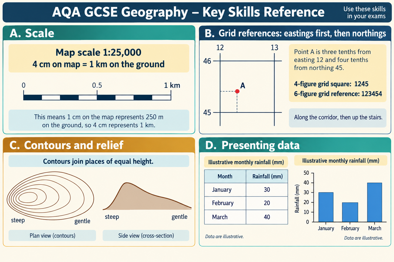
Ordnance Survey grid references use a national grid divided into squares. A four-figure reference identifies a 1 km square on a 1:50 000 map. Read the easting first, then the northing: “along the corridor, then up the stairs.” The first two digits locate the vertical grid line and the next two locate the horizontal grid line. A four-figure reference points to a square, not a precise feature within it.
A six-figure reference gives a more precise position, to approximately 100 m within a 1 km square. First locate the four-figure square. Then estimate tenths across the square from its west edge, followed by tenths up from its south edge. If a church is about 0.4 across and 0.7 up the square, add those digits in eastings-then-northings order. Read the whole square carefully before estimating; reversing the two components can place the point far away.
Use the grid lines printed on the map rather than the edge of the paper. If the map extract is rotated, grid north still follows the grid lines. Give the reference requested by the question and do not report a six-figure location as more accurate than the map scale allows.
Direction and orientation
North on an OS map is normally at the top when the grid is upright. A north arrow or grid lines confirm orientation. Cardinal directions are north, east, south and west; intercardinal directions include north-east, south-east, south-west and north-west. A compass bearing is measured clockwise from north, from 000° through 360°. If a question asks only for a general direction, “south-west of” may be sufficient; use a three-figure bearing when the task requires greater precision.
Distinguish compass direction from “uphill” or “downstream.” Contours and drainage show the shape of the land, so a river may flow towards the top of a map if the ground rises in that direction. Use spot heights, contour values and the V-shape of contours across a valley to check relief and flow direction.
3. Scale, distance and area
Representative fractions and linear scales
A scale of 1:50 000 means one unit measured on the map represents 50 000 of the same units on the ground. Thus 1 cm represents 50 000 cm, or 500 m, or 0.5 km. Convert only after multiplying, and keep track of units. At 1:25 000, 1 cm represents 250 m. The larger the second number, the smaller the scale and the larger the ground area shown in less detail.
Worked straight-line example: On a 1:50 000 map, a route measures 6.4 cm. Ground distance is 6.4 × 50 000 = 320 000 cm. Divide by 100 000 to convert centimetres to kilometres: 3.2 km. A useful check is that each centimetre is 0.5 km, so 6.4 cm should be a little over 3 km.
Use the scale bar if the map has been resized or printed, because a written scale may no longer match the image. A scale bar shrinks or enlarges with the map. Measure carefully from the zero mark, not from the end of the line. State whether you have measured a straight-line distance or a route distance.
Curved distance
A river, road or coastline can be measured with a piece of thread, a flexible ruler or repeated short straight segments. Follow the centre of the feature consistently, mark the endpoints, then compare the measured length with the scale. A series of straight chords cuts across bends and underestimates the route; many short segments follow it more closely. Very small map measurements and thick lines create uncertainty, so do not claim unrealistic precision.
Straight-line distance answers “how far apart are the points?” Route distance answers “how far along this feature or journey?” A settlement may be 2 km from a town in a straight line but much farther by road because of relief, a river, a bridge location or the street network. Say which measure you use.
Area and density
For a simple rectangle, area = length × width. For irregular map areas, overlay a grid, count full squares and estimate partial squares, or use a suitable GIS measurement tool if available. State the map scale and approximate boundary. A choropleth often shows a rate or density rather than a total; read the legend title to see whether a dark shade means a high count, high percentage or high value per unit area.
Density is a quantity divided by an area, such as people per square kilometre. Convert square units with care: 1 km² is 1 000 000 m², not 1 000 m². Population density can make places of different size easier to compare, but a mean density hides local clustering and empty land. A high average for a district does not mean every street is crowded.
Gradient and relief
Gradient describes vertical change compared with horizontal distance. A map may express it as a ratio, such as 1:20, or as a percentage. First calculate the height difference between two points using contour values or spot heights; then measure the horizontal ground distance using the map scale. Keep units consistent before dividing.
Worked example: A path rises 80 m over a horizontal ground distance of 1 600 m. The ratio is 80:1 600, which simplifies to 1:20. As a percentage, 80 ÷ 1 600 × 100 = 5%. The ratio says one unit of horizontal distance accompanies one-twentieth of that amount in vertical change; the percentage gives vertical rise per 100 horizontal units. State which form the question requests.
Gradient is not the same as the difference in height. Two routes can have the same total ascent but different gradients if one is longer. For a curved or winding route, specify whether the distance is horizontal map distance or distance along the path. A map measurement is an approximation, especially where the line is irregular.
4. Contours, spot heights and landforms
Contours join points of equal height above a stated datum, usually mean sea level. The contour interval is the vertical difference between adjacent contour lines. Close spacing indicates a steep slope; wide spacing indicates a gentler slope; evenly spaced contours suggest a fairly uniform slope. Contours that close around higher values form a hill. A spot height gives the elevation of a particular point; a trig point marks a surveyed position and height.
Contour patterns show landform shape. A valley contour forms a V that points uphill or upstream, towards higher ground; the river flows down-valley in the opposite direction. Spurs often project downhill from higher ground. A broad valley has widely spaced contours across the valley floor; a narrow valley has contours packed more tightly. A plateau may have a relatively flat top enclosed by steep sides. Use values and spacing together rather than recognising shapes by appearance alone.
Drainage patterns can offer clues about geology and relief, but a short map extract may not show enough tributaries to identify a full pattern confidently. Dendritic drainage branches irregularly, often where rock resistance is similar; trellis drainage is influenced by alternating resistant and weaker bands; radial drainage flows away from a high central area. These are interpretations of the visible network and its setting, not labels to add without evidence.
Cross-sections and transects
A cross-section shows change in height along a line. Place a strip of paper along the transect, mark every contour crossing and spot height, and transfer those positions and elevations to graph axes. Label horizontal distance and vertical height with units. A vertical exaggeration makes relief easier to see but can make slopes look steeper than they are; calculate it or state it where asked.
A transect can record relief plus human or physical features along the same line: settlement, land use, vegetation, channel width or coastal profile. Keep the sample intervals clear and plot the observations at their actual distances. A transect gives a narrow slice through the landscape. It may miss features to either side, so use a map or photographs for spatial context.
5. Reading maps as geographical evidence
Before interpreting an atlas, thematic or OS map, check the title, date, scale, legend and source. A thematic map may use colours, symbols, lines or scaled circles. Read the categories in the key in order and note whether the intervals are equal, unequal or open-ended. Equal colour steps can make comparisons straightforward; unequal classes may exaggerate some differences. A mapped association is useful evidence but may reflect the way boundaries or classes were chosen.
Describe distributions with exact spatial language: clustered, dispersed, linear, nucleated, concentrated, isolated, coastal, upstream, peripheral or adjacent. Identify the strongest cluster, a contrasting area and any exception. Refer to named places or grid squares and use map evidence such as contour values, road density or river position. Avoid saying only “there are more here.”
Relief, drainage and settlement together
Physical and human features often have a spatial relationship. Settlement may follow a valley route or avoid steep slopes; roads may cross a river at a bridge; reservoirs may occupy a valley; tourism may cluster near accessible landscapes. To explain an association, use a plausible geographical mechanism and the evidence visible on the map. A road and town being close together does not prove the road caused the town’s growth; older routes, industry, planning and topography may also matter.
When comparing maps of different dates, check whether their scales, keys, boundaries and data definitions match. A settlement may appear larger because a map has more detail rather than because it has grown. A road may be newly labelled rather than newly built. Use dates and map evidence to make a cautious comparison.
Landscape features at large scale
Large-scale maps show detail over a relatively small area. In coastal, fluvial and glacial landscapes, connect symbols and contour shapes to process evidence. At a coast, look for cliffs, beaches, headlands, bays, promenades, groynes or sea walls; ask whether the map shows a landform, a management feature or both. In a river landscape, identify channel bends, floodplain width, tributaries, bridges and changes in valley form. In a glaciated landscape, look for corries, arêtes, U-shaped valleys, tarns and steep valley sides, then check contours and drainage.
Maps use conventional symbols. Do not confuse a physical feature with a line of transport or a boundary. The key explains symbols, but some features are represented by colour, contour form or line pattern rather than a dedicated icon. If an inference depends on a symbol, quote or describe that symbol so the reader can follow the interpretation.
6. Photographs, sketches and satellite images
Photographs record a view from a particular position, direction, height and moment. Begin by locating the viewpoint if a map or caption is provided. Identify the foreground, middle ground and background; compare features across the frame; then use landform, land use, vegetation, buildings, transport and management evidence to interpret the scene. “A river is in the foreground and hills are behind it” is description. Explaining that a settlement follows a valley floor because the gentler relief allows transport and building is interpretation, and should be used only when the scene supports that explanation.
Ground-level photographs
Ground photographs show visible detail and relative position but can hide features outside the frame. Use foreground, middle distance and background to organise description. Look for scale, material, condition, land use, vegetation, slope, drainage, buildings and evidence of change. A photograph of a dry riverbed may show low water at that moment; it does not by itself establish long-term drought. A photograph of a crowded street may have been taken at a special event or peak time. Use the date, caption and additional evidence to judge representativeness.
Perspective affects apparent size. Near objects look larger, and a wide-angle view may distort distances. Do not estimate a building’s true height or the width of a river from appearance alone unless a known object or scale is provided. Avoid assuming that a photograph represents the whole settlement, coast or region. It is a sample of a scene from one viewpoint.
Aerial and satellite imagery
An aerial photograph may be taken obliquely or vertically. An oblique view shows sides of objects and can make relief easier to recognise; a vertical image resembles a plan view but makes height harder to judge. Satellite imagery can cover a much wider area and may use visible or non-visible wavelengths. A false-colour image does not show colours as the human eye sees them; check the key and sensor description before inferring vegetation, water or built-up land.
Use shape, size, texture, pattern, tone or colour, shadow, site and situation as clues to identify features. A regular grid of streets and large roof footprints may indicate planned development or industrial land; a branching network may indicate drainage or roads. These are clues rather than proof. Verify interpretations against a map, legend, date or another image where possible.
Comparing images can show change. Check that the location, season, resolution and viewing angle are comparable. A field may appear brown in a dry season and green after rain without a change in land use. Construction may be hidden by cloud or shadow. If the image pair differs, state how that affects the comparison.
Sketches and annotations
A sketch map or field sketch selects the most important features rather than copying every detail. Use a clear title, north arrow or viewpoint, labels, a key where categories are used, and an approximate scale if relevant. Keep symbols legible and explain what they represent. A field sketch should show the shape and relative position of the landscape; add annotations to identify processes, land use or evidence, not decorative commentary.
When annotating a photograph, connect each note to a visible feature. “Steep slope” should point to the slope; “possible mass movement” should identify evidence such as a scar or displaced material, and should be qualified if the image is ambiguous. Separate observation from inference with wording such as “the exposed rock face may indicate…” rather than treating an interpretation as directly visible fact.
7. Choosing and constructing graphs
Choose a graph because it answers the question, not because it is familiar. First identify the data: are they categories, counts, continuous measurements, proportions, grouped values or paired variables? Then select a display, choose a scale that uses the space sensibly, plot accurately, label units and include a title. A graph should make the pattern easier to inspect without concealing the raw values or exaggerating differences.
Line graphs
Use a line graph for continuous change, often over time or distance, when joining adjacent values makes sense. Put the independent variable on the horizontal axis and the dependent measurement on the vertical axis. Label both axes with units and give equal intervals equal spacing. Plot points accurately and join them only when the data represent a continuous sequence. For separate sites or dates with no meaningful intermediate value, a scattergraph or discrete points may be more appropriate.
Describe overall direction, turning points, peaks, troughs and exceptions. Use values at the start and end, and identify an interval of rapid or slow change. A line between two measurements does not prove that change was smooth between them; say “increased between the recorded dates” if observations are sparse.
Bar charts and divided bars
Use a bar chart for categories or discrete groups. Leave gaps between bars to show that the categories are separate. A divided or stacked bar shows the composition of each total, often as counts or percentages. Make sure each bar uses the same width and the segments add to the stated total. A grouped bar chart can compare categories across locations or time periods, but use a clear key and do not overcrowd it.
Bars usually begin at zero because their length encodes magnitude. A truncated axis can make small differences look dramatic. If a question gives a non-zero axis, notice the effect and describe it; when constructing a chart, choose a scale that shows the data fairly. Do not use bars to imply continuous values between unrelated categories.
Pie charts and pictograms
A pie chart shows parts of one whole. Convert each category to an angle: category proportion × 360°. If there are 60 commuters out of 200, the share is 60 ÷ 200 = 0.30, or 30%; the sector angle is 0.30 × 360° = 108°. Add all percentages or angles to check they total 100% or 360°, allowing for small rounding differences. A pie chart works poorly when there are many tiny categories or when values need precise comparison across several places.
A pictogram represents values with symbols. State what one full symbol represents and show how partial symbols are used. Keep symbol size consistent; changing icon size as well as icon count can mislead. Pictograms are accessible for simple comparisons but are less precise than a labelled bar chart.
Histograms and frequency diagrams
A histogram represents continuous data grouped into class intervals. The bars touch because values are continuous. With equal class intervals, bar height can show frequency directly. If class widths differ, compare frequency density rather than raw frequency: frequency density = frequency ÷ class width. The area of each bar then represents the frequency. Always label the horizontal class intervals and the vertical measure so the reader knows whether the axis gives frequency or frequency density.
For example, a class of width 5 containing 20 observations has frequency density 4. A class of width 10 containing 30 observations has density 3. The second class contains more observations overall, but its bar is shorter because the observations are less concentrated per unit interval. Unequal intervals plotted as if they were equal distort the distribution.
Scattergraphs
A scattergraph compares paired values for two variables. Put the possible explanatory or independent variable on the horizontal axis and the response variable on the vertical axis when that matches the question. Each point represents one paired observation. Look for positive, negative or no clear association, and identify clusters, gaps and outliers. A line of best fit should follow the overall pattern with a reasonable balance of points above and below; it should not be forced through the origin unless the relationship and evidence justify it.
An association can be strong or weak and may be linear or curved. One outlier can affect a trend line, so check whether it is an error or a meaningful site. A relationship between two variables does not prove that one causes the other. For example, rainfall and river discharge may be related, but geology, land cover, catchment size, antecedent moisture and water management also affect river response.
Use a line of best fit to estimate a value within the range of observations (interpolation) more safely than beyond the range (extrapolation). Predictions become less reliable further from the measured data and where conditions may change. State that a value is estimated from the trend, not directly observed.
Population pyramids
A population pyramid compares age groups, commonly with males on one side and females on the other. Read the axis units: the bars may show counts, percentages or population per age group. Compare widths at the same age and sex, and identify broad-base, narrow-base or irregular features. A wide base often reflects a relatively large younger population; a narrower base may reflect lower recent birth rates. A notch among working-age adults could reflect migration, conflict, disease or a past change in birth rates; use context before selecting an explanation.
The pyramid is a snapshot for a stated date. It can suggest future needs—schools, jobs, health care or pensions—but does not predict them alone. Migration, policy, fertility, mortality and economic change affect the population structure over time.
8. Completing thematic maps
Thematic maps display a variable across space. Choose a symbol and classification suited to the data, give a clear key and preserve location. A map can reveal clusters or routes that a table hides, but class boundaries affect the apparent pattern. State the units and date, and distinguish a total from a rate.
Choropleth maps
A choropleth shades areas according to a value, usually a rate or proportion such as population density or percentage access to a service. Divide the data into classes and assign a sequential light-to-dark scheme for low-to-high values. Use a diverging scheme only when values have a meaningful midpoint, such as above and below zero. Include units, boundaries, date, source and class intervals in the key.
Large areas can dominate the visual impression even if they contain few people; small dense areas may be hard to see. This is the modifiable areal unit problem: patterns can change when data are grouped into different boundaries or scales. A district average can hide variation inside the district. Do not compare two choropleths unless their definitions and class intervals are compatible.
Isoline maps
An isoline joins places with the same value, such as equal temperature, rainfall, pressure or height. Values between measured points are interpolated, so the exact line location is estimated. Isolines should generally be smooth and should not cross. Close spacing indicates a rapid change in the mapped variable; wide spacing indicates a gradual change. A closed loop may enclose a high or low, so read the labels or key to determine which.
When completing an isoline map, plot the measurement points first. Estimate where each value lies between observations, then draw a smooth line that reflects the pattern. Do not put the line through a point with a different measured value. Sparse observations, barriers and complex terrain reduce confidence in the interpolated surface.
Dot, proportional-symbol and flow-line maps
A dot map uses repeated dots to show a distribution. The key states the number represented by one dot. Place dots where the data are located if possible; random spacing within a large area can imply an even distribution when the actual population is clustered. A dot map shows concentration well but can become unreadable in dense places.
Proportional symbols vary in size to represent totals at locations. For circles, the area—not the radius—should be proportional to the value. A circle with twice the radius has four times the area, so simply doubling radius exaggerates the data. A graduated-symbol key helps the reader compare sizes. Symbols may overlap and hide smaller values; explain this limitation.
Flow-line maps show movement between origins and destinations. The line direction shows where something moves; width may represent volume. Include arrows and a width key. A line’s route may be schematic rather than the exact road or river path. Use flow maps for migration, trade, commuting, water transfers, energy or sediment, and identify both source and destination.
Desire lines connect origins and destinations, often with line width showing the volume or number of journeys. They simplify actual routes to show movement relationships. A dense set of lines can obscure locations, so use appropriate scale, line weights and a clear legend. Do not interpret a thicker line unless the key explains its meaning.
9. Numerical skills and showing working
Numerical methods help compare places, time periods and processes. Write the formula or calculation, substitute values with units, calculate carefully and present a sensible rounded result. Check that the answer is plausible and that the numerator and denominator refer to compatible quantities.
Ratios, proportions and rates
A ratio compares quantities. A scale of 1:50 000 compares map distance with ground distance; a ratio of 3:2 could compare two land-use areas. Simplify both sides by the same factor and state which quantity comes first. A proportion expresses a part of a whole: part ÷ total. Multiply by 100 to convert it to a percentage.
A rate compares a quantity with time, area, distance or another denominator: for example, pedestrians per ten minutes, deaths per 100 000 people, or tonnes per hectare. Check that comparison rates use the same denominator. Comparing 100 cars in five minutes with 150 cars in ten minutes directly is misleading; convert both to a per-minute rate (20 and 15 vehicles per minute).
Frequency is how often an event occurs or how many observations fall in a category or interval. A higher frequency in one class means more observations were recorded there; it does not necessarily mean the process occurs more often in the whole population if sampling effort differed. Record the sample size and observation period.
Percentage change
Percentage change compares change with the starting value:
percentage change = (new value − starting value) ÷ starting value × 100
A positive result is an increase; a negative result is a decrease. If a settlement population rises from 40 000 to 50 000, the change is 10 000; 10 000 ÷ 40 000 × 100 = 25% increase. Dividing by the new value would give a different and usually incorrect answer to “percentage increase from the original.”
For a fall from 80 to 60, the change is −20; −20 ÷ 80 × 100 = −25%, or a 25% decrease. Avoid saying “fell by 20%” when the value actually fell by 20 units. A percentage change is undefined when the starting value is zero. Large percentages can result from a small base, so compare the original counts too.
Magnitude, units and area
Magnitude is the size of a value or event. Check the unit prefix: kilo means 1 000, mega means 1 000 000. Convert before calculating if values use different units. One kilometre is 1 000 metres; one hectare is 10 000 m²; one km² is 100 hectares. One litre is 1 000 millilitres. Do not mix linear and squared units: converting km² to m² requires multiplying by 1 000 000.
For density, divide the total by the area: 24 000 people in 12 km² gives 2 000 people per km². For a percentage, divide the part by the relevant total: if 360 of 900 households have a specified service, 360 ÷ 900 × 100 = 40%. Always identify the correct total. If the question asks the percentage of households, do not divide by the total population.
Accuracy, sample size and controls
Accuracy describes closeness to the true or accepted value. Precision describes the resolution or consistency of measurement. Reliability concerns whether repeated use of the method produces consistent results. Validity concerns whether the method measures what the enquiry intends. These ideas are connected but not interchangeable.
Sample size matters because a small sample can miss variation, but a large biased sample does not become representative just through volume. A control group or comparison site can help distinguish an intervention’s effect from background change, where appropriate. Keep procedures consistent: same equipment, interval, duration, height, observer instructions and conditions as far as possible. Record unavoidable differences.
10. Statistical skills
Statistics summarise data. Before choosing a measure, inspect the distribution, sample size, outliers and data type. A statistic is useful only if it answers the question and represents the data fairly.
Mean, median, mode and modal class
The mean is the total of values divided by the number of values. It uses every observation, which is useful for a fairly balanced distribution, but an extreme outlier can pull it upwards or downwards. For values 3, 4, 4, 5 and 9, the mean is 25 ÷ 5 = 5.
The median is the middle value after ordering observations. For an odd number of observations it is the central one; for an even number it is the mean of the two central values. In the example above, the median is 4. It is less affected by the value 9, so may better represent a skewed distribution such as house prices or travel times.
The mode is the most frequent value or category. It works for categorical data as well as numbers, but there can be several modes or none that is meaningful. In grouped continuous data, the modal class is the interval with the greatest frequency (or frequency density if class widths differ). It does not reveal the exact most common individual value.
Range, quartiles and interquartile range
The range = maximum − minimum. It is simple and shows the full spread but depends heavily on the extremes. Quartiles divide ordered data into four parts. The lower quartile (Q1) marks approximately the 25th percentile; the median is the 50th percentile; the upper quartile (Q3) is the 75th percentile. The interquartile range is IQR = Q3 − Q1, the spread of the middle half of the observations.
Compare both central tendency and spread when two sites have similar averages. Two beaches might have the same median pebble size but different IQRs, indicating one sample is more varied. Quartile positions can be calculated by different conventions in small samples, so use the method taught or specified and apply it consistently. Do not claim that quartiles are exact physical boundaries between four equal groups when there are tied or grouped values.
Cumulative frequency and percentiles
A cumulative-frequency table adds class frequencies progressively. The final cumulative frequency should equal the total sample size. A cumulative-frequency curve rises from the lower boundary of the first class to the upper boundary of the last. Read the median at half the total frequency, Q1 at one quarter and Q3 at three quarters; interpolate across to the curve, then down to the value axis. These are estimates for grouped data.
A percentile indicates the value below which a specified percentage of observations falls. The 90th percentile is a threshold exceeded by roughly 10% of the observations, subject to the method and sample. Percentiles can help compare a value with a distribution, but the sample and reference population must be relevant. An unusual value relative to one neighbourhood may be typical of another.
Relationship, trend lines and predictions
When describing bivariate data, state the direction, strength and form of the relationship. “As distance from the town centre increases, median house price generally decreases in this sample” describes a negative association. Refer to clusters, outliers and the range of values. Avoid claiming that every point follows the trend if there are exceptions.
Sketch a trend line through the main cloud of points, with a broadly balanced distribution above and below. An estimated line of best fit is not a line joining the first and last point. Use it to interpolate within the observed range or, more cautiously, extrapolate beyond it. Explain that extrapolation assumes the relationship continues; this may fail when a process changes, such as a river reaching a reservoir or urban land use crossing a planning boundary.
Correlation does not demonstrate causation. A scattergraph between elevation and temperature may show a physical relationship, but latitude and weather conditions also vary. An association between deprivation and health may be influenced by age structure, access to services, employment and housing. Suggest a mechanism and consider other variables before explaining why the points form a pattern.
Selective presentation and misleading statistics
Statistical presentation can mislead through a truncated axis, unequal class intervals, a changing boundary, an omitted denominator, an unrepresentative sample or a selective date range. A graph that begins at 95 rather than zero can make small differences look huge. A total number may be larger in a populous place even when the rate is lower. Averages can hide distribution and inequality; a regional mean may conceal a deprived neighbourhood and a wealthy one.
Check the title, axis origin, intervals, units, sample size, source, date and definitions. Ask whether the sample includes different groups and places; whether values are totals, rates or percentages; and whether missing values could alter the pattern. Identify a specific weakness and its likely effect. “The graph may be biased” is weak; “the vertical axis starts at 90, so a two-unit difference appears visually large” explains the problem.
11. GIS and geospatial information
A geographical information system (GIS) stores, displays and analyses data linked to location. Data may be represented as vector features—points, lines and areas—or raster cells such as satellite pixels or elevation grids. A map layer might show roads, flood zones, population, land use, elevation or service locations. Combining layers can reveal patterns and proximity that are hard to see in a table.
Layers must use compatible coordinate systems, dates, scales and definitions. If a school layer is compared with population by district, the school point locations and district boundaries should refer to a comparable period. A map of flood risk can be overlaid with homes or transport routes to examine exposure. The overlay identifies spatial coincidence; further evidence is needed to estimate actual damage or explain vulnerability.
GIS can calculate distance, area, routes, density, buffers and spatial intersections. A buffer around a river can show buildings within a chosen distance, but the selected distance is an analytical assumption. Straight-line buffers may not reflect travel routes, barriers or flood flow. A service-access map based on distance to a clinic may overlook opening hours, transport costs, language, disability access and capacity.
The quality of a GIS result depends on input data and decisions. Resolution affects detail; an old layer can miss recent development; inaccurate coordinates can misplace a feature; an arbitrary boundary can change summary statistics. When reading a GIS output, ask what layers were used, how they were classified, what assumptions were made and who or what may be omitted. A polished map is not automatically objective.
12. Qualitative and quantitative evidence
Quantitative evidence is numerical: rainfall totals, counts, distances, percentages and scores. It can be compared and summarised, but definitions and sampling determine what the numbers mean. Qualitative evidence includes interview responses, observations, descriptions, photographs and written accounts. It can reveal experiences, meanings and local detail, but may reflect a limited viewpoint or interpretation.
Use the evidence type that fits the question. A traffic count can compare vehicle flow at two sites; interviews may explain why residents choose a route. A temperature series can quantify a microclimate; photographs and notes can show shade, surface material and wind exposure. Combining methods is called triangulation: evidence from different methods can support, complicate or challenge one another.
Triangulation is not a simple vote. Three sources repeating the same original claim are not independent confirmation. A measurement may be precise but collected at an atypical time; a small interview sample may reveal a serious concern without showing how common it is. Explain what each source contributes, its scale and limits, and whether the methods actually measure the same aspect of the issue.
13. Explain patterns and write clearly
Geographical writing should connect observation to process. Use a structured sentence: pattern + evidence + explanation. For example: “Rainfall is highest on the western slope, where totals exceed 2 000 mm on the map, because moist prevailing air is forced to rise over relief, cool and condense.” The figure identifies the pattern; the process explains it. If the source is a long-term average, say so rather than describing one storm.
To compare places, use a comparative statement and evidence for each: “Site A has a larger proportion of built surface than Site B (72% compared with 41%), which may increase rapid runoff; however, the drainage network and soil permeability could also affect flood response.” This is more useful than two disconnected lists. Keep values and units close to the claim they support.
Use command words carefully. Describe asks what the evidence shows; compare requires similarities or differences; explain asks why or how; assess/evaluate requires weighing evidence or significance; justify asks for reasons supporting a decision. An answer can include several stages, but make the requested task clear. A description should not become a long explanation before the pattern is stated.
For an extended argument, organise paragraphs around points that answer the question. Refer to a named place, a map location, a statistic or a process. Use linking words to show cause, contrast and consequence. Define a technical term through its use where needed. Avoid unsupported generalisations such as “people always settle near rivers” or “developing countries are poor”; patterns vary by place, time and scale.
14. Choosing a method and checking your result
Before starting a calculation or graph, pause to check the task:
- What variable is being measured, and what is its unit?
- Is the value a total, average, rate, proportion or change?
- What is the spatial and temporal scale?
- Which display or statistic fits the data type?
- Does the method require equal class intervals or a common denominator?
- Have the source, date, sample size and method been provided?
After calculating, make a reasonableness check. A percentage cannot normally be below zero if it represents a share; a percentage change can be negative. Density should use area units; a gradient ratio should compare vertical and horizontal distance; pie-chart sectors should total one circle. If a result seems implausible, check unit conversion, transcription and denominator before rounding.
If two sources give different values, do not immediately decide one is wrong. They may use different boundaries, dates, definitions, survey methods or units. Explain the difference where possible. A national census count and a local estimate may measure different populations; an annual rainfall total differs from a long-term average. Source comparison is part of geographical reasoning.
15. Worked mixed-resource interpretation
Imagine an unfamiliar map extract showing a river valley, a town, a relief key and a small table of rainfall. The question asks why housing is concentrated on one side of the valley and where flooding might affect transport. Begin with orientation: note the river, contour spacing, roads, bridge and settlement symbols. State the map scale and identify the higher and lower sides using contour values, not colour alone.
The settlement may be concentrated on the gentler slope above the floodplain, while the railway and road follow the valley floor. Quote the actual map evidence: for example, wide contour spacing on the settlement side and a bridge where the road crosses the river. Explain cautiously that gentler land may make construction easier, while the valley provides a transport corridor. The map does not by itself tell you land prices or planning history.
For possible transport exposure, identify routes that cross or run close to the channel and low-lying land indicated by the map. If the table gives rainfall, describe the amount and period, then explain how prolonged or intense rainfall could raise river discharge. Do not claim that a road will flood without a flood-depth or hazard map. Conclude with a bounded inference: the crossing and nearby low ground appear exposed relative to higher routes, but a flood-risk assessment would need flood extent, drainage and design information.
This sequence—locate, describe, explain, qualify—keeps the answer tied to the resources and uses subject knowledge without claiming more than the data show.
Place example
Practise on unfamiliar UK and global contexts, since skill questions can draw on any specification theme. Use accurate fieldwork examples from your own enquiries for Paper 3 responses.
Maps, data and evidence
Show calculation steps, units and sensible rounding. For a six-figure grid reference, read eastings then northings. For a choropleth, inspect class breaks before comparing colours. For a photograph, orient and locate before describing. Use an appropriate graph and scale; describe scattergraph association without claiming causation, and avoid extrapolating far beyond the plotted data.
Common misconception
A map symbol is not self-explanatory without its key. Averages can hide outliers, and a visual pattern does not establish causation.
Self-check
- How do you measure a straight-line distance on an OS map?
- Which graph best shows change over time, and why?
- What checks should you make before comparing two datasets?
Revision points
Be accurate, label units and use evidence in the sentence. In longer answers, move from description to explanation and evaluation rather than listing values.
Curriculum alignment
- Curriculum coverage IDs:
aqa.3.4.geographical-skills - Related practice packs:
gcse_geo_p3_geographical_applications_june_2022,gcse_geo_p3_geographical_applications_june_2023,gcse_geo_p3_geographical_applications_june_2024,gcse_geo_p3_geographical_applications_november_2020,gcse_geo_p3_geographical_applications_november_2021 - Shared concept tags:
geographical-skills,maps,numeracy,data-interpretation
Sources
- Curriculum/specification: https://www.aqa.org.uk/subjects/geography/gcse/geography-8035/specification/subject-content/geographical-skills
- Further reading: Ordnance Survey: Geography education resources
- For case-study facts, use the source list and figures selected by your teacher; dates, totals and local conditions can change between datasets.